The Results tab is the home of all things visualisation. Let’s explore what you’ll find in here to help you to create and manage your data visualisations.
Study Dashboards:
You can have as little or as many Dashboards as you need for your Study. When you first create a Study you are automatically gifted two Dashboards. They will slightly vary depending on the type of Study and what tools you include in your Template but the premise of providing you with an overview is the same.
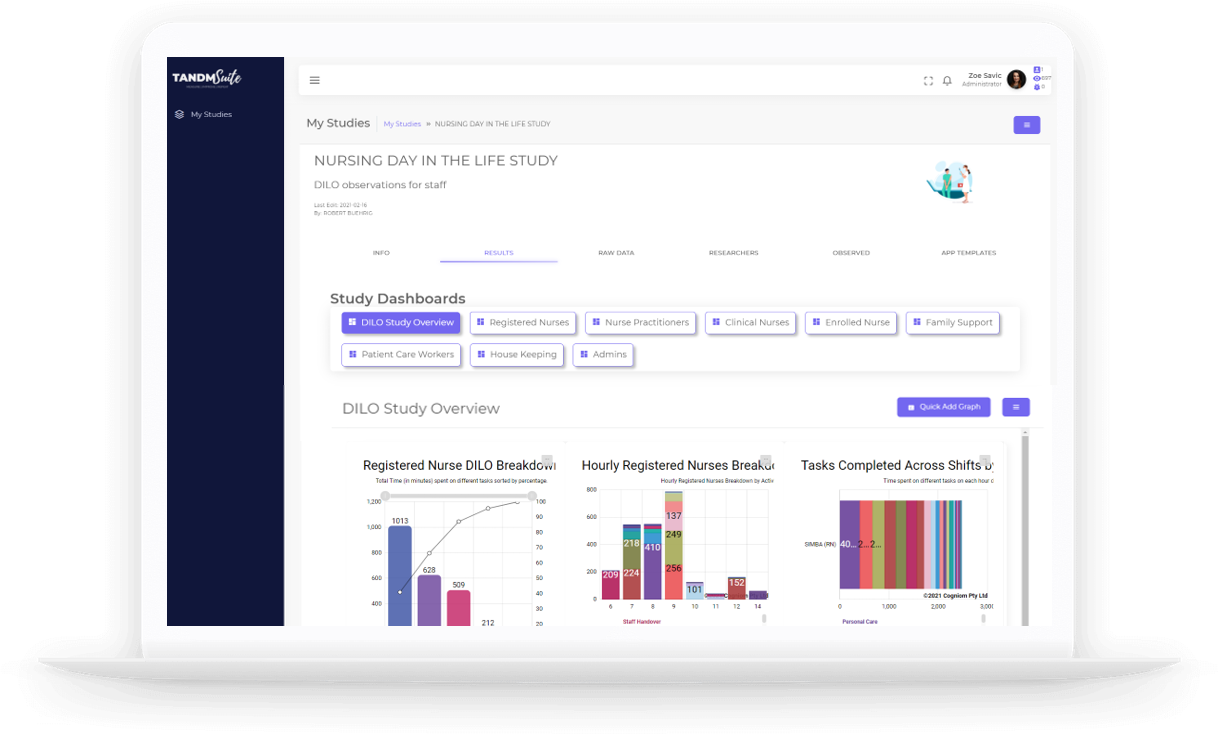
Survey
Overview | Includes a stacked bar graph to show results for all questions
Survey Question Results | A graph (usually a pie) per question showing responses for each
Interview
Overview | Includes a stacked bar graph to show results for all questions
Interview Question Results | A basic graph, depending on question type, per question showing responses for each
Self Tracking
Overview | Includes a gantt chart to show results spread across a period of time
Items To Track | A bar graph (or stacked bar) per task / button included on the template
Watch and Learn
Overview | Includes a gantt chart to show results spread across a period of time
Items to Watch | A graph (usually a pie) per question showing responses for each
“How is there already data in my graphs?”
Robots. Or “Robo Data” as its affectionately known in house. We’ll get to that topic soon, but it is designed to help you understand what results will look like immediately without having to wait to collect actual data to see whether you are on point or not.
You are welcome to discard or keep these Graphs as you please. Note, the gantt chart is used as part of the review and cleansing process.
NOTE: To learn more about Data Review and Cleansing, or Import/Exporting Data for major updates, jump over to the Your Study tab.
Hamburger Menu:
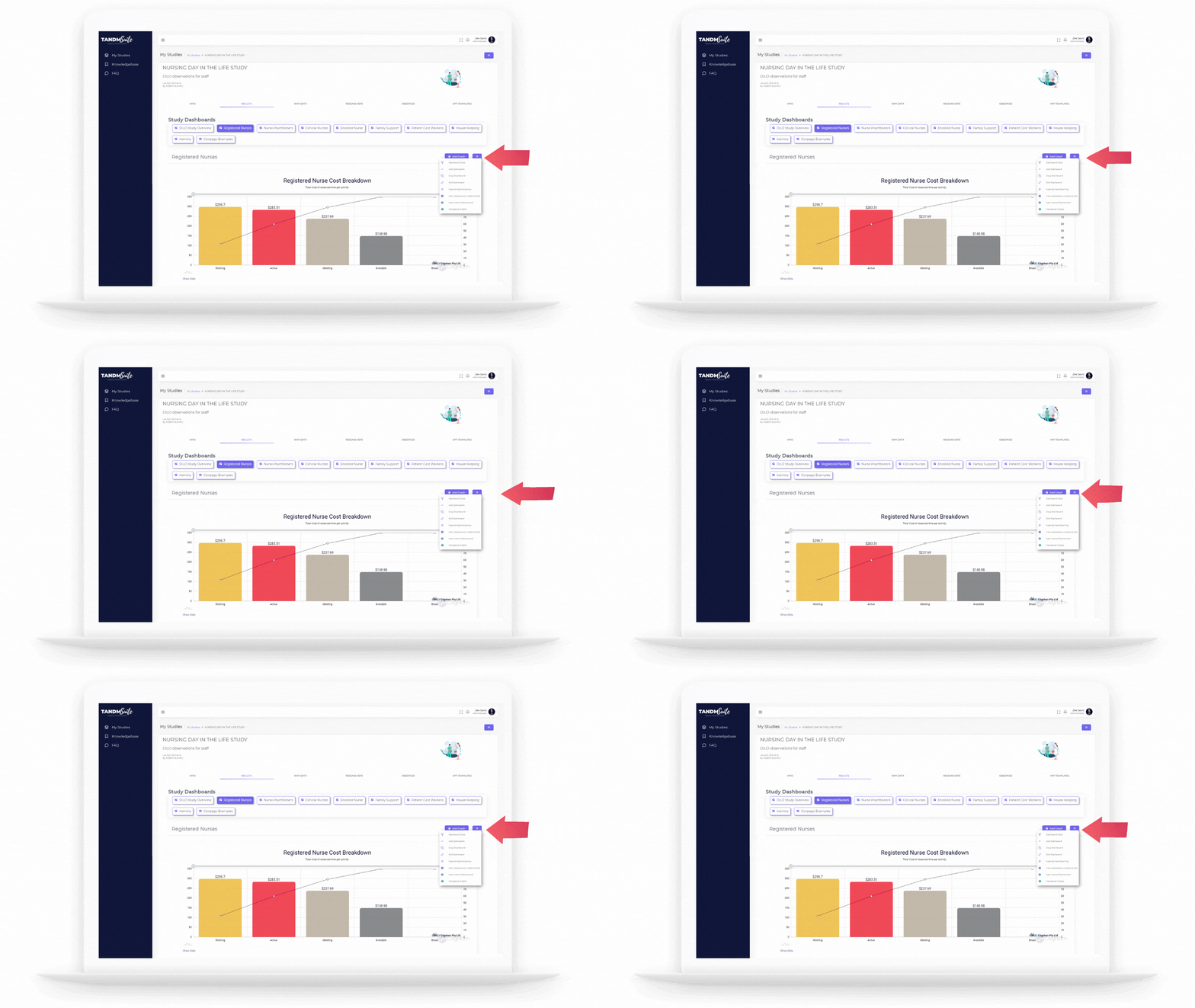
Just like on every tab there is a hamburger menu providing extra tools options and support.
Here you will find:
– Dashboard Data
– Add Dashboard
– Copy Dashboard
– Edit Dashboard
– View Dashboard in External Tab
Keep scrolling to learn more about each option!
Dashboard Data
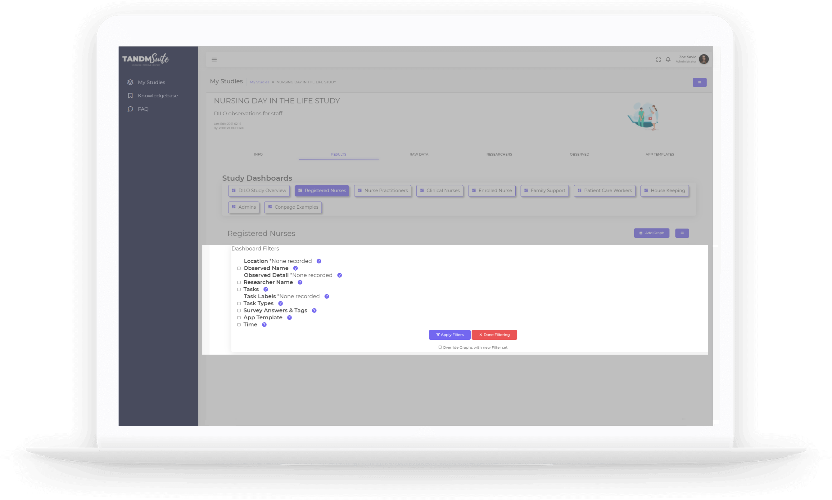
Filter | Drill deeper into your overall data by using filters as opposed to filtering for individual graphs. Click here to reveal filtering options. Click the tick boxes to activate the filter and/or display further filtering options
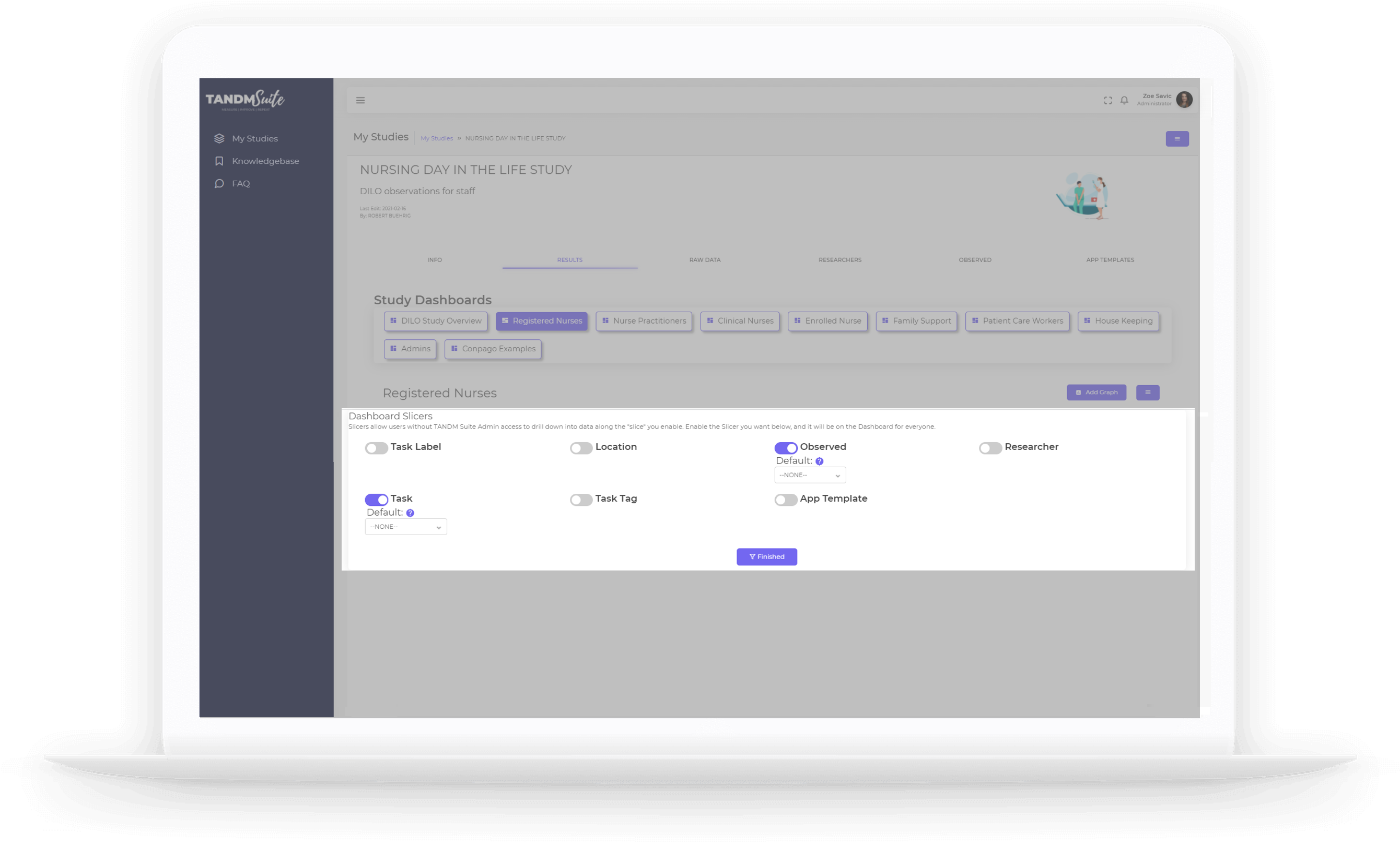
Slicer | Activating this option provides filtering opportunities for public displayed Dashboards. See “View Dashboard in External Tab” for more.
Click this option and toggle the items you want present for public dashboard filtering. Use the dropdown menus to select the default view for each.
Add Dashboard
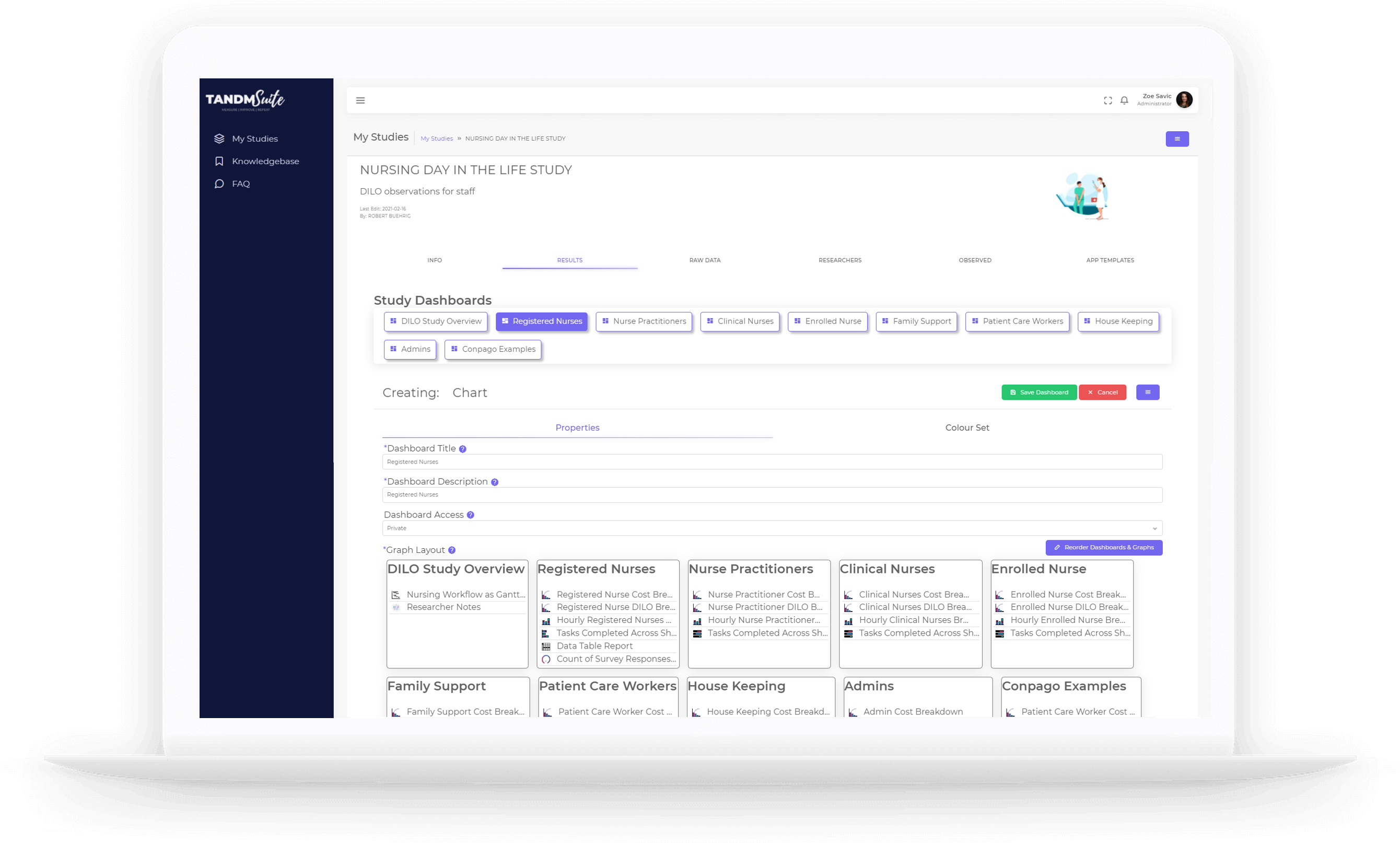
This will take you to the Edit Dashboard screen where you can enter the Dashboard title, description, access and colour preferences:
Properties | Give your new Dashboard a name and a description and mark whether it can be accessed publicly or will require a log in. See “View Dashboard in External Tab” for more.
Colour Set | Apply overall colour preferences as well as targeted colour sets to ensure continuity. If the same item is being used through multiple graphs, that it will always display in the same colour.
Copy Dashboard
This is an effective tool to prevent you from recreating the wheel. When the layout and types of graphs are the same but you might wish to display the information with a different filter (eg: Job Role).
This will also navigate you to the Edit Dashboard screen.
Edit Dashboard
Here you can edit the Properties and Colour Sets (as mentioned above) as well as manage the overall appearance and Graph order :
Dashboard Access
This allows you to change access between private and public. Use private to ensure only people with a log in can access the dashboard or Public to allow anyone with the link to access. See “View Dashboard in External Tab” for more.
Reorder Graphs & Dashboards
Click the corresponding purple button and you will be able to drag and drop graphs to display in different orders and different dashboards. You can also delete graphs by dragging them into the Delete table.
Clear all Graphs
Perhaps it was just the Dashboard settings you wanted to recreate but not necessarily the Graphs? Click on the hamburger menu again to click “Clear All Graphs”. You’ll be prompted with a “are you sure?!” message, you know, just in case! Click Confirm to continue or Cancel if you change your mind.
Delete Dashboard
Click on the Hamburger menu again, click on “Delete Dashboard” you’ll be prompted with a warning message which you can cancel or confirm. Once deleted, you will be taken back to the first Dashboard in the list.
View Dashboard in external tab
Click here to open the Dashboard in its own webpage. Copy the link from the webpage toolbar if you wish to share this view with others without the need for a login.
Add Graph
We will get into detail about this further on, but simply click the purple “Add Graph” button to kick start your Graph building adventure!
