TYPE: New
WHERE IS IT: TANDM Mobile App
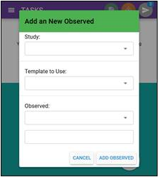
FEATURE: Multi Observed
SUMMARY: From logging in to the TANDM app you can add multiple observed in ANY study and/or ANY template all in one go.
WHY IT MATTERS: Researchers can now track multiple observed parties or objects as needed – with each new Observed added creating a new tab for researchers to switch between.
TYPE: New
WHERE IS IT: TANDM Mobile App
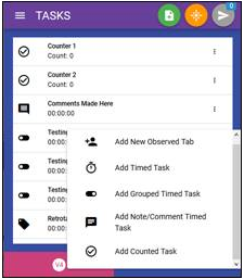
FEATURE: Add Items on the Fly
SUMMARY: Using the vertical ellipses (triple dots) you can add additional Observed TABS as well as basic study items such as timers and counters
WHY IT MATTERS: Researchers will be able to update their study framework when required without disruption to the study project
TYPE: New
WHERE IS IT: TANDM Mobile App
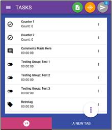
FEATURE: Colour Scheme
SUMMARY: Each new Observed TAB you create will generate a new colour, which is based on the colour palate you select in the Template section through the TANDM Admin page
WHY IT MATTERS: Now that there is the opportunity to be studying multiple parties at the same time, this is the most efficient way to identify different tabs.
TYPE: New
WHERE IS IT: TANDM Mobile App – Queue
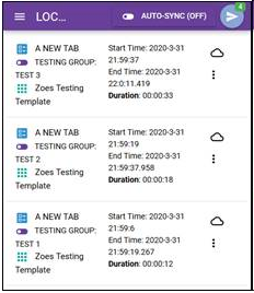
FEATURE: Collected Data View
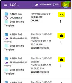
SUMMARY: Researchers will be able to see at a glance the TAB, timing tool and template the data was collected under. Start/Finish time stamps as well as timer duration is also visible
WHY IT MATTERS: This helps researchers identify data points with far superiour clarity than ever before
TYPE: New
WHERE IS IT: TANDM Mobile App – Queue
FEATURE: Syncing Data to Dashboards
SUMMARY: The blue paper plane button is still available in the top toolbar to sync all, but now there is also the option to sync individual line items.
WHY IT MATTERS: Researchers will also be able to differentiate between items that have already been synced and not with the cloud icon changing for all that have been synced.
TYPE: New
WHERE IS IT: TANDM Mobile App – Queue
FEATURE: Edit Collected Data
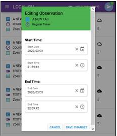
SUMMARY: The ellipsis on the Queue page now allows you to edit and delete individual items on the fly, before syncing to the Dashboard
WHY IT MATTERS: This gives researchers greater control over the quality of data being synced to the dashboard, significantly reducing errors
TYPE: New
WHERE IS IT: TANDM Mobile App
FEATURE: Side Menu
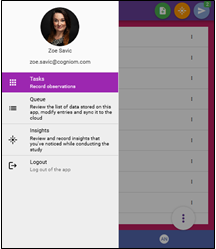
SUMMARY: The side fly out menu bar is much the same as before, but now with some personal touches. This is also where you can find the dedicated Insights section for easy reference.
WHY IT MATTERS: The side menu allows for greater visibility and better user experience for the researcher
TYPE: New
WHERE IS IT: TANDM Admin Page
FEATURE: Observations
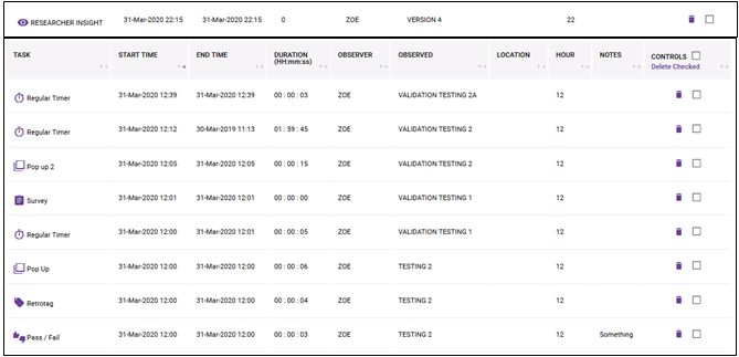
SUMMARY: Insights now sync with the rest of the collected data and display in the Observations page, now identified by the icons
WHY IT MATTERS: This provides a clearer view of all observations collected and allows for easy analysis as well as data mining of Insights
TYPE: New
WHERE IS IT: TANDM Admin Page
FEATURE: Observed Details
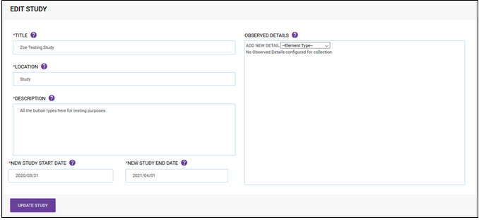
SUMMARY: After creating a new Study (or editing an existing Study), there is a new section called “Observed Details”, on the right hand side of the screen.
WHY IT MATTERS: This gives a third element to graphing. Now on top of graphing against time, task, observed etc, the Observed Details section will allow you to add filters unique to your Study. Things like, job title, age group, location etc giving more options to view your data, and drill down further than ever before..


