TYPE: New
WHERE IS IT: TANDM Admin
FEATURE: Report Builder
SUMMARY: From the dashboard of graphs created from the TANDM Admin page you can build the components of your report to look however you want. There are areas to import graphs from ANY study your company has conducted, making cross reference and comparison incredibly easy. Text boxes can be added to include more insight and detail and are fully formattable. Company colour schemes and logos to really personalise them are also included features. These reports can also be exported to PDF and can be saved in the TANDM Admin page.
WHY IT MATTERS: Clients can stay inside one program from start to finish on their projects; something that just isn’t possible with many other data collection tools. So many of them rely on excel exports or external calculators and third party visualisation software to complete their studies which adds to the whole problem of taking too long and being too expensive.
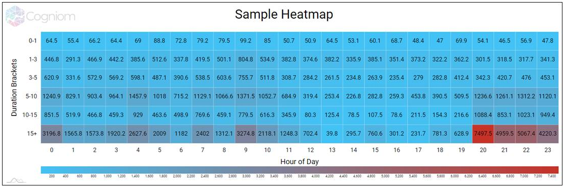
TYPE: New
WHERE IS IT: TANDM Admin
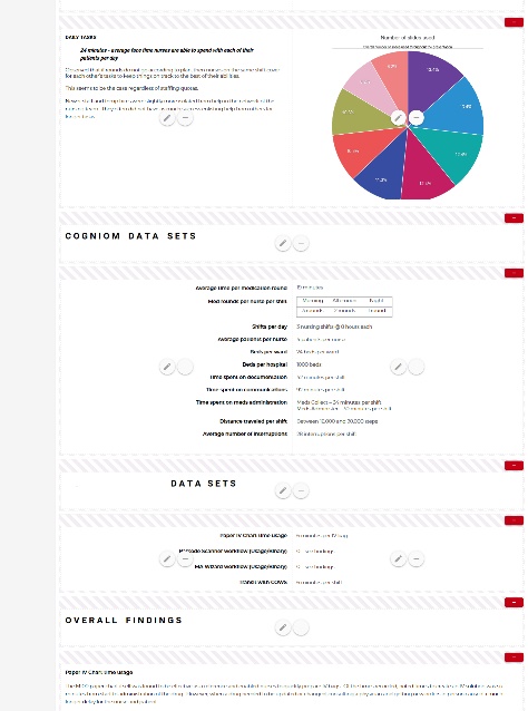
FEATURE: Graph – Heatmaps
SUMMARY: Our new library allows for both a “healthy” colour and a “bad” colour. Currently this is still a custom feature available upon request, but Cogniom’s near future goal is to allow you to leverage this right alongside all the other graph types!
WHY IT MATTERS: Heatmaps are great at drawing the eyes to where attention is needed
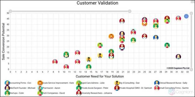
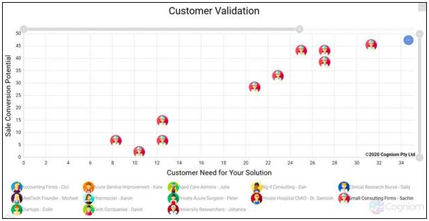
TYPE: New
WHERE IS IT: TANDM Admin
FEATURE: Graph – Scatter Images
SUMMARY: This next level scatter plot charting include swaps data points for avatars. On the TANDM Dashboard the graphs are fully interactive, allowing the user to zoom in on a specific area, or focus attention on one group in particular.
WHY IT MATTERS: This is especially helpful when used for groupings, like Customer to Market Type studies, allowing the user to easily identify different groups.
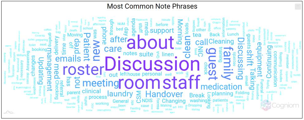
TYPE: New
WHERE IS IT: TANDM Admin
FEATURE: Graph – Word Cloud
SUMMARY: With popularity and functionality of our TANDM Survey study option growing, the word cloud graph type gives an instant visual on the topics most talked about throughout your study.
WHY IT MATTERS: This is a great way to show the Notes and Insights collected to quickly identify trends.
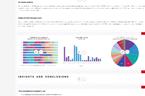
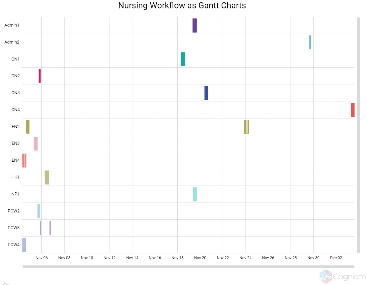
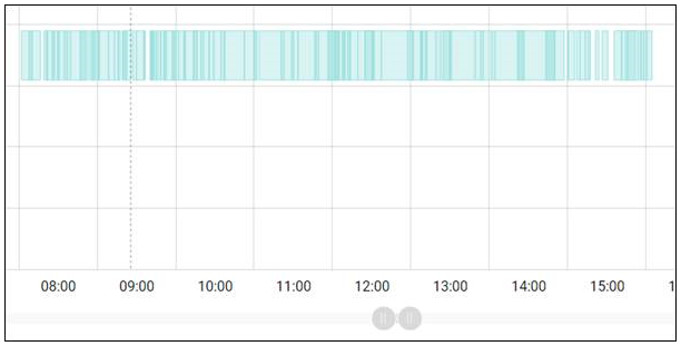
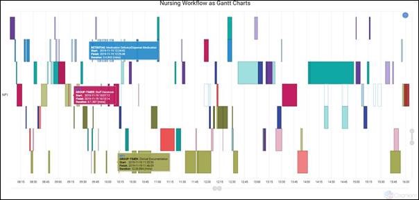
TYPE: Update
WHERE IS IT: TANDM Admin
FEATURE: Graph – Gantt Chart
SUMMARY: Dynamic Time scale – Use the scrollbar to zoom or drag the mouse over the area you want a closer look at and the chart will zoom in down to minutes and even seconds to give you the most detailed look at your data.
Category – Clicking on a category listed on left hand side of the chart will automatically zoom in to the data collected for that particular observed party. You’ll be able to see the individual channels (activities of the same or similar nature) in each of their rows, allowing you to identify the repeating patterns where time is being spent the most. By clicking on a block, you will be able to see the tooltip for that particular Observation.
You can reset to the original full view by clicking the blue circle in the top right corner of the chart
WHY IT MATTERS: We’ve had Gantt charts fora while now, but these upgrades allows the user to dive deeper into te data collected.
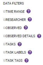
TYPE: Update
WHERE IS IT: TANDM Admin
FEATURE: Graph – Filters
SUMMARY: Includes “Observed Details” options to filter by. Filters for Task Labels andTags have also been included.
WHY IT MATTERS: This enables the user to drill down into the data in the best way that suits the project.
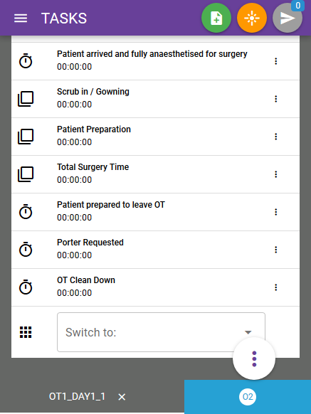
TYPE: Update
WHERE IS IT: TANDM Mobile App
FEATURE: Switch Between Templates
SUMMARY: From the Study Task screen on your mobile device, simply scroll to the bottom of the study to reveal the switch function. Clicking the drop down box will allow you to move to the next template within the study for that particular observed party.
WHY IT MATTERS: Gives the user unprecidented flexibility when collecting data over multiple observed parties or loacations within one study framework