A ‘ KINDER ‘ TANDM SUITE
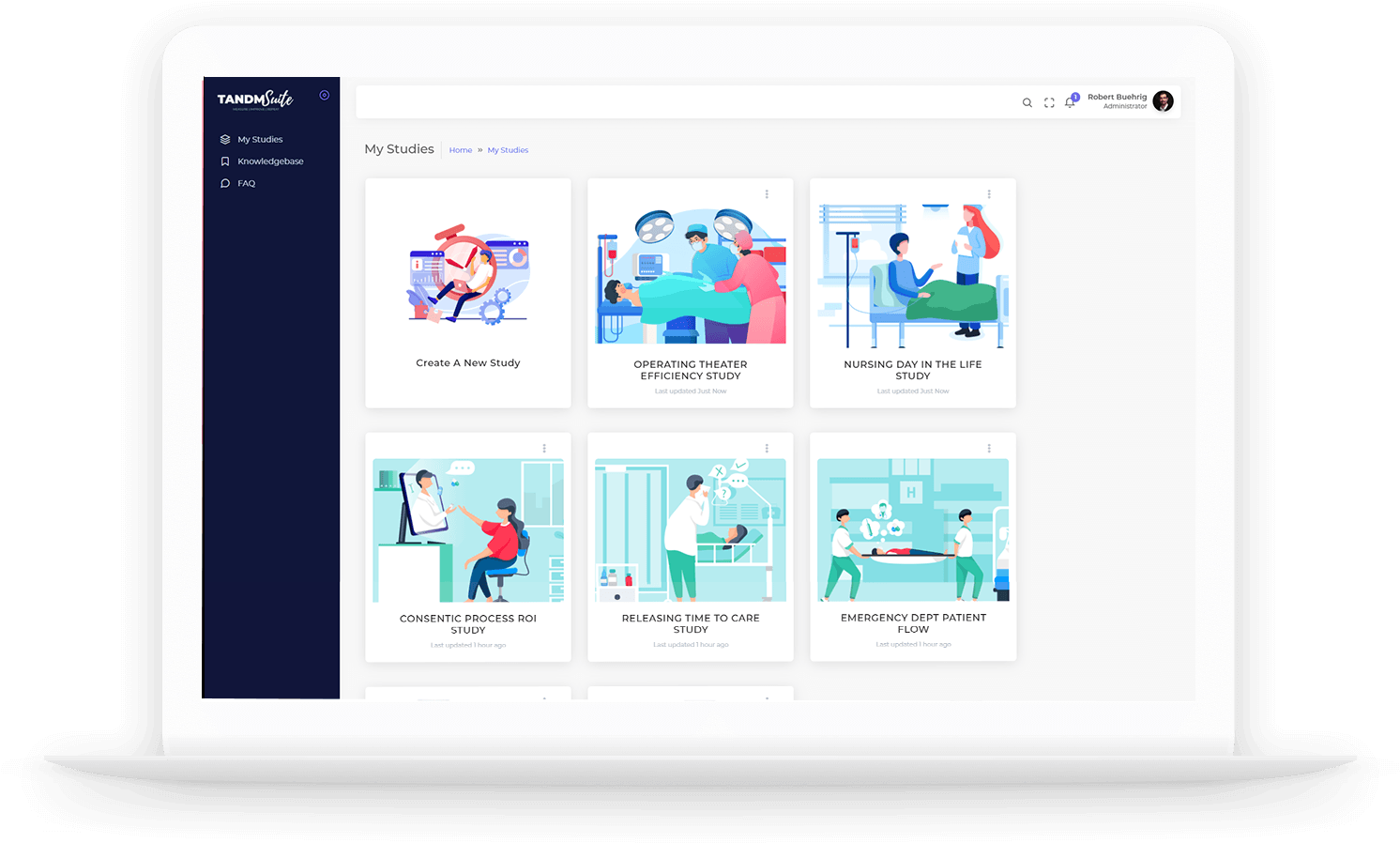
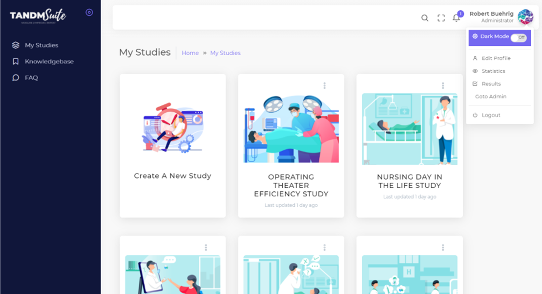
1. Your User name
2. Select ‘Try New UX’
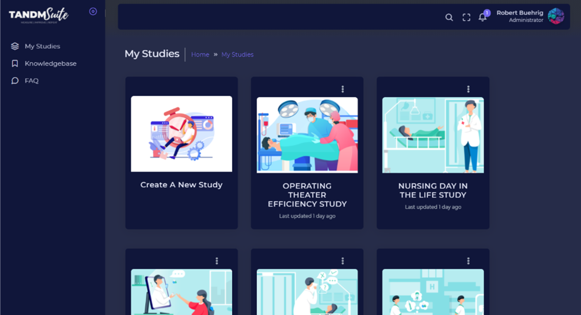
and you will be redirected to the new look interface.
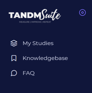
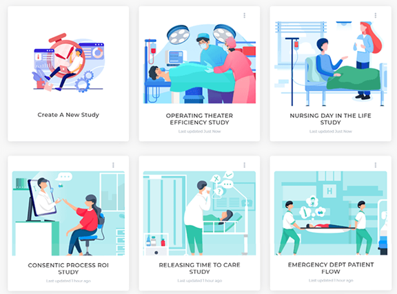
The side navigation is much simpler now and by clicking ‘My Studies’ it will take you to your Study Hub, as picture above
The team will be in touch to give you a tour soon!
Building a new study.
It doesn’t matter the size of your company, what industry you’re in or why type of project you want to get underway, the barrier to completing these tasks should not be the “too hard basket”.
Now, setting up a study from scratch can be done in four easy steps, in a fraction of the time and present the very real possibility that you might have FUN doing it!
Here is how it goes:
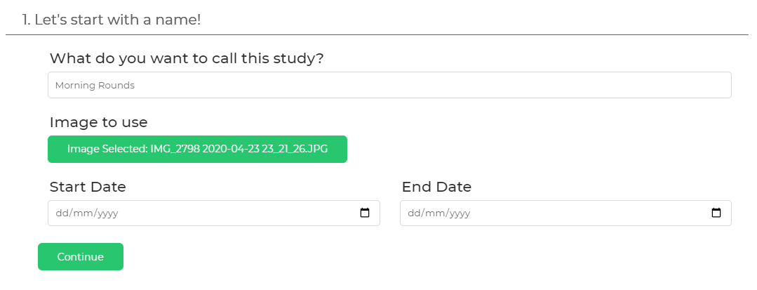
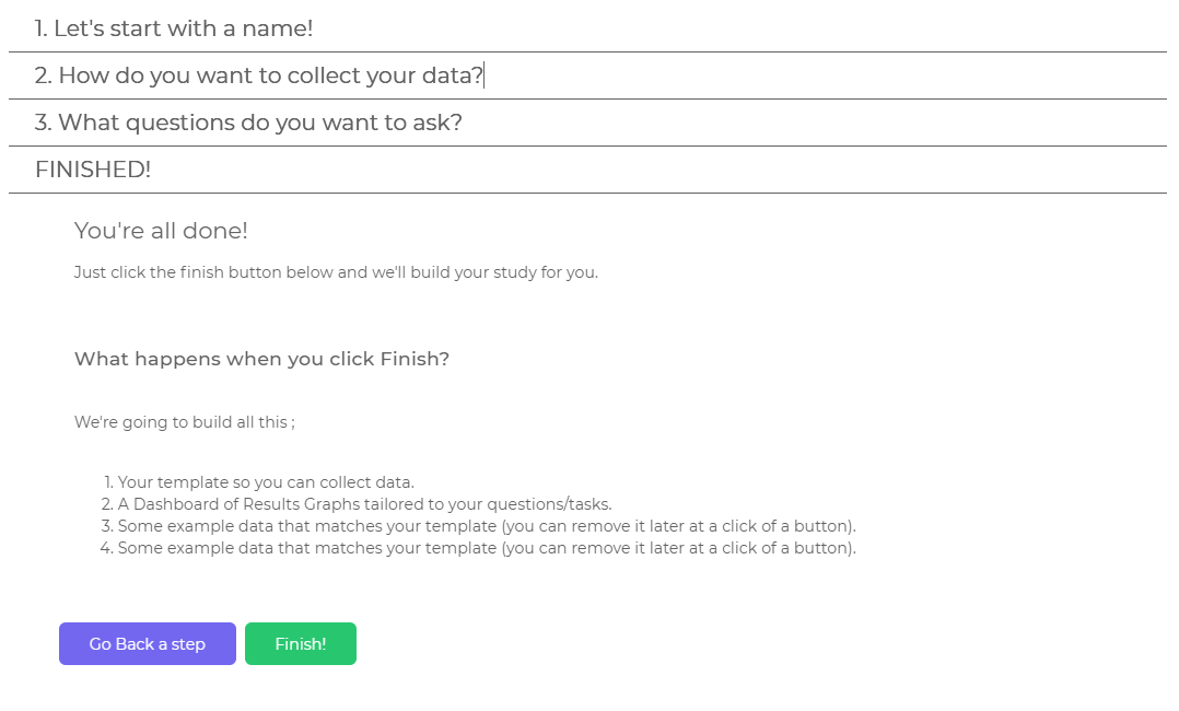
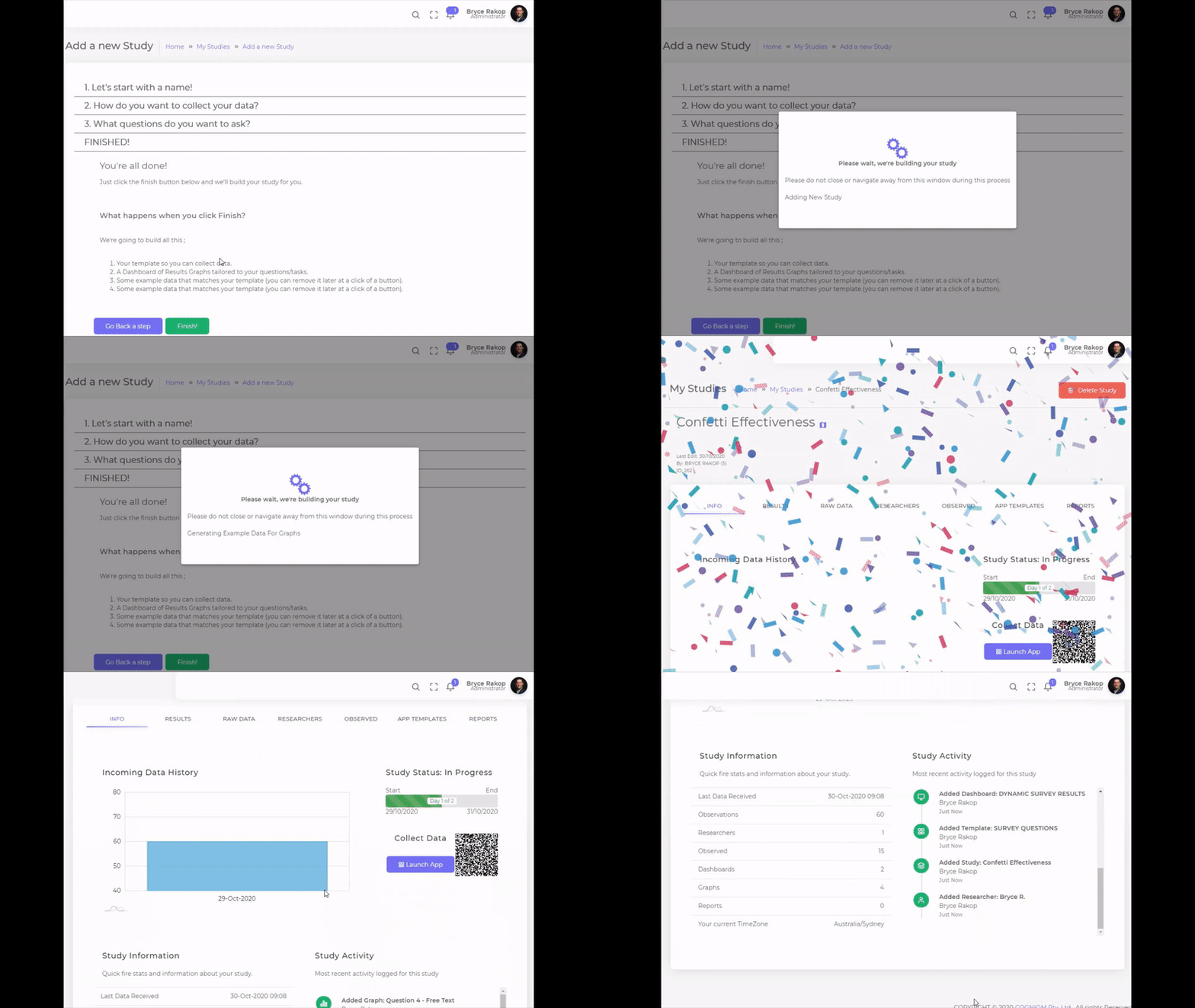
1. Basic set up of naming your study, attaching an image and determining the length of the project.
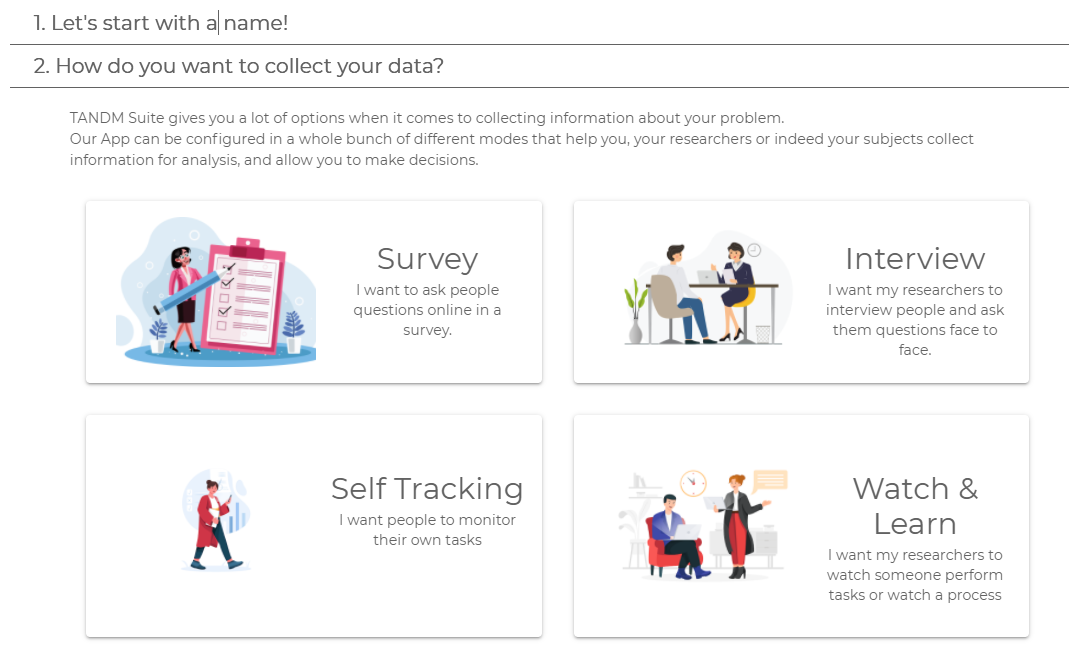
2. Decide what type of study – survey for the masses, interveiwing, self tracking or observational.
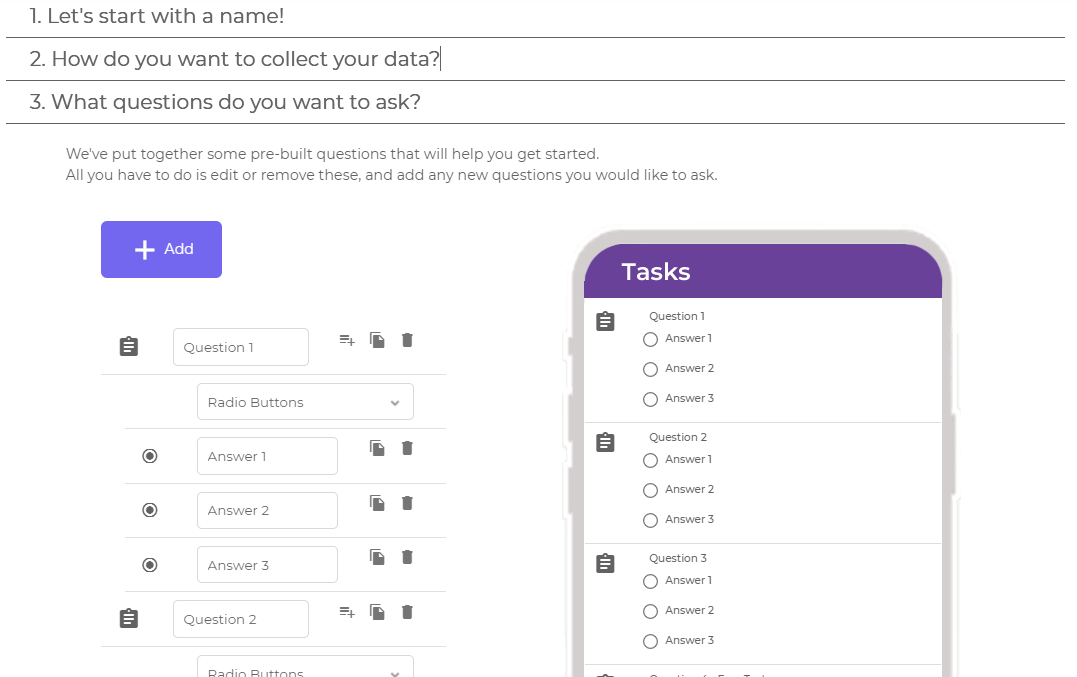
3. Set up the questions or items you want observed / answered, and you can actually watch it update the mock app to understand what it will look like on your phone.
4. Finished! Double check all your steps, go back to adjust if required, and once that finish button is pressed, the TANDM Suite does the rest!
It takes a matter of moments to to process and you’re on your way to celebrations and data collections!
Take a look…
Managing your existing studies.
Templates,
Graphs,
Dashboards, etc
Now all of these components are kept inside each Study component, making managing your projects so much easier.
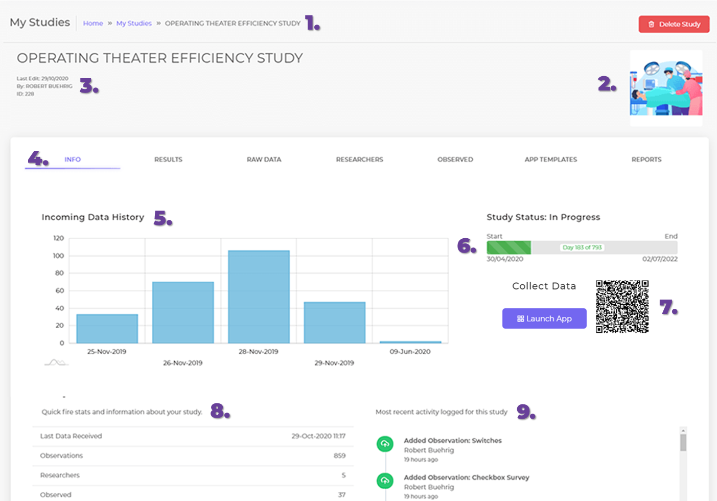
1. Breadcrumb navigation
2. Option to upload images
3. Incoming data summary
4. Tabs for easy navigation
5. Tracking for incoming study data
6. Progress tracing of project
7. App launch with a QR code
8. Quick project stats
9. Study activity log at a glance
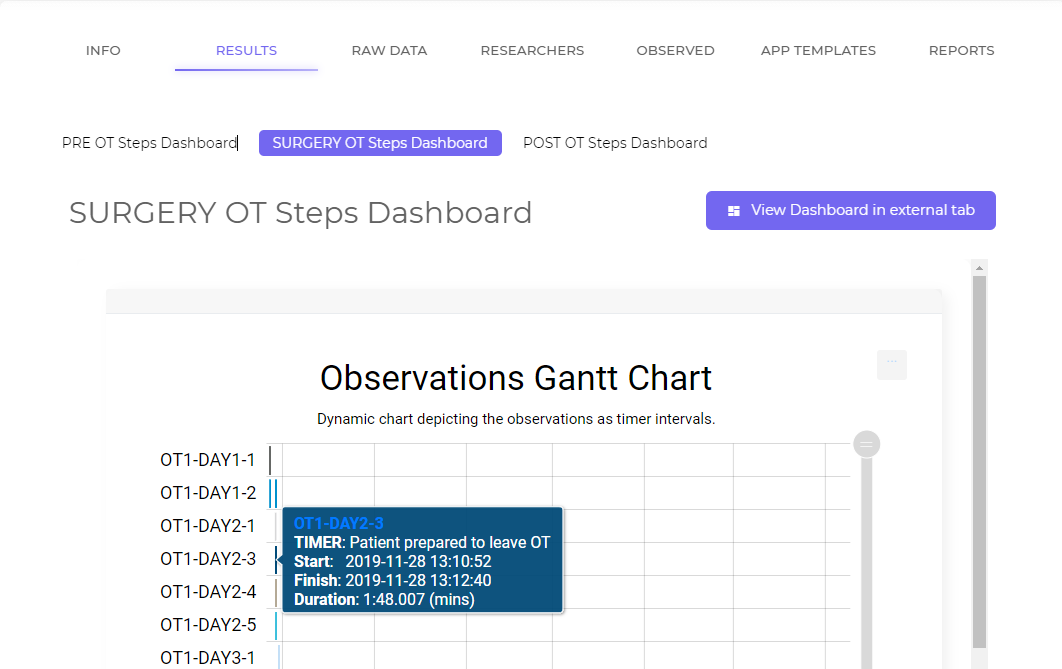
1. If you decide to have more than one dashboard you can easily toggle between them to view and
2. Once ready to view the Dashboard proper there is an easy launch button to view all your data in a separate screen.
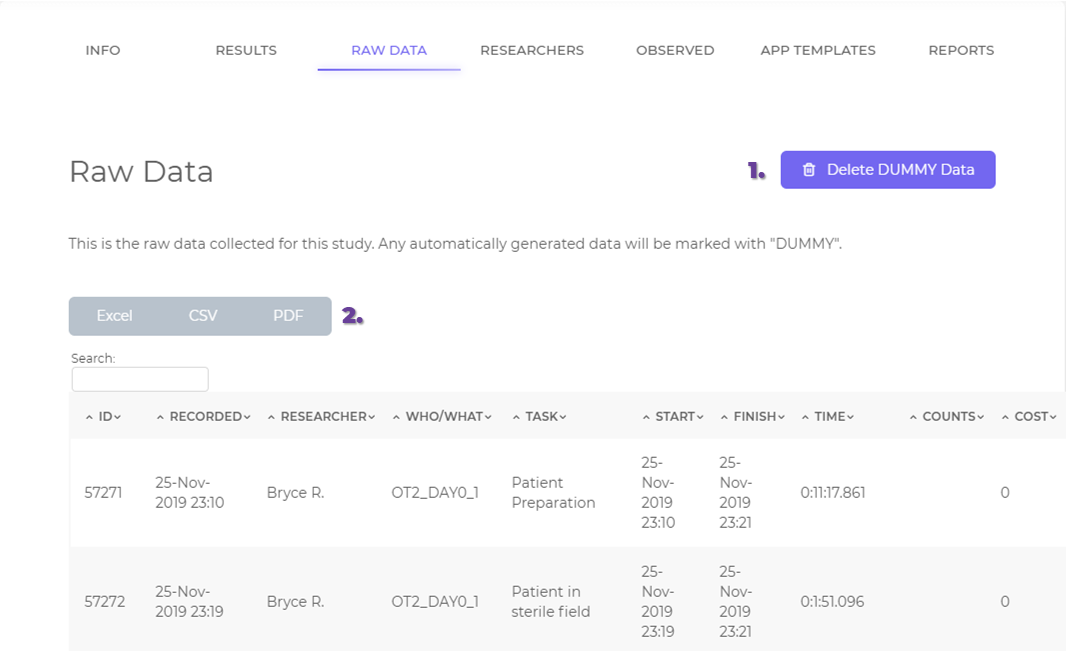
1. With a new study, dummy data will be automatically included to give you an idea of how data will display with your chosen data visualisation tools. Once real data is collected the dummy data is easily removed.
2. Data is easily exportable to excel, CSV and PDF
1. With a new study, dummy data will be automatically included to give you an idea of how data will display with your chosen data visualisation tools. Once real data is collected the dummy data is easily removed.
2. Data is easily exportable to excel, CSV and PDF
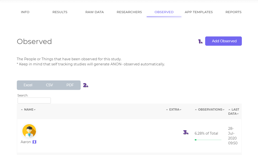
1. Add new observed
2. Export Observed data
3. Gain insights to their involvement with a study
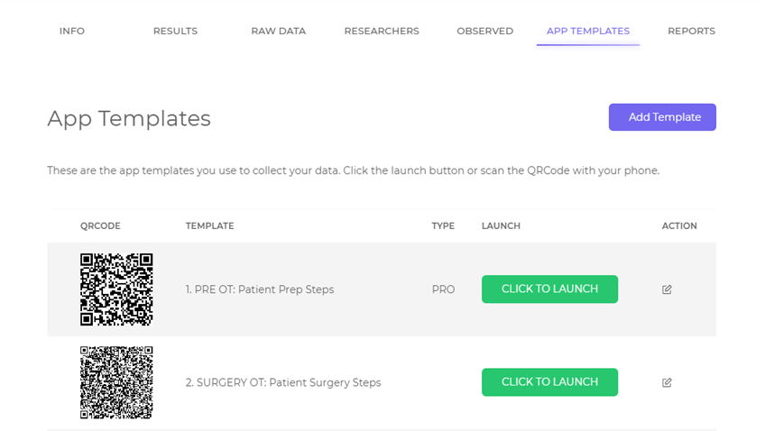
1. Add a new template
2. Make launching the app with multiple people easy with the QR Code
3. Quick launch in a new browser
4. Edit existing tempaltes
1. Add new observed
2. Export Observed data
3. Gain insights to their involvement with a study
Simply click on your user name at the top right hand side of the screen to toggle between the options.
Metrics
- Point to Point – For complicated workflows you want to tie the start of step 2 to the end of step 7, and call that a new observation. Point to Point metrics do just this. Once configured they will automatically look for pairs of Observations and add a measure of the time between them. Great for measuring overall patient visit times, or any other time you have a known repeatable process you want to measure.
- Until – Sometimes you don’t know what’s going to happen next, but you don’t want to wait around watching a timer run to measure the … waiting. So, instead, use an “Until Metric”. These will run from the End of one timer until the next one happens. These are explicitly designed for “ball in court” measurements. Vender did this, waited on client for that, client did this, waited on vendor for that. It’s what you need when a process takes days or weeks with only a few touch points in between.
- *Calculated – These are the Holy Grail for data analysts. Imagine all the formulas you would normally do in Excel to parse data, but instead leveraging a pre-configured study with the maths built in, and you just get that one number you wanted out for each data set. This is still in testing with the Cogniom team, but for us it means not only are the apps for collecting data dynamic and codeless, but the formulas to analyse the data is as well! More to come on this in November!
Return on Investment
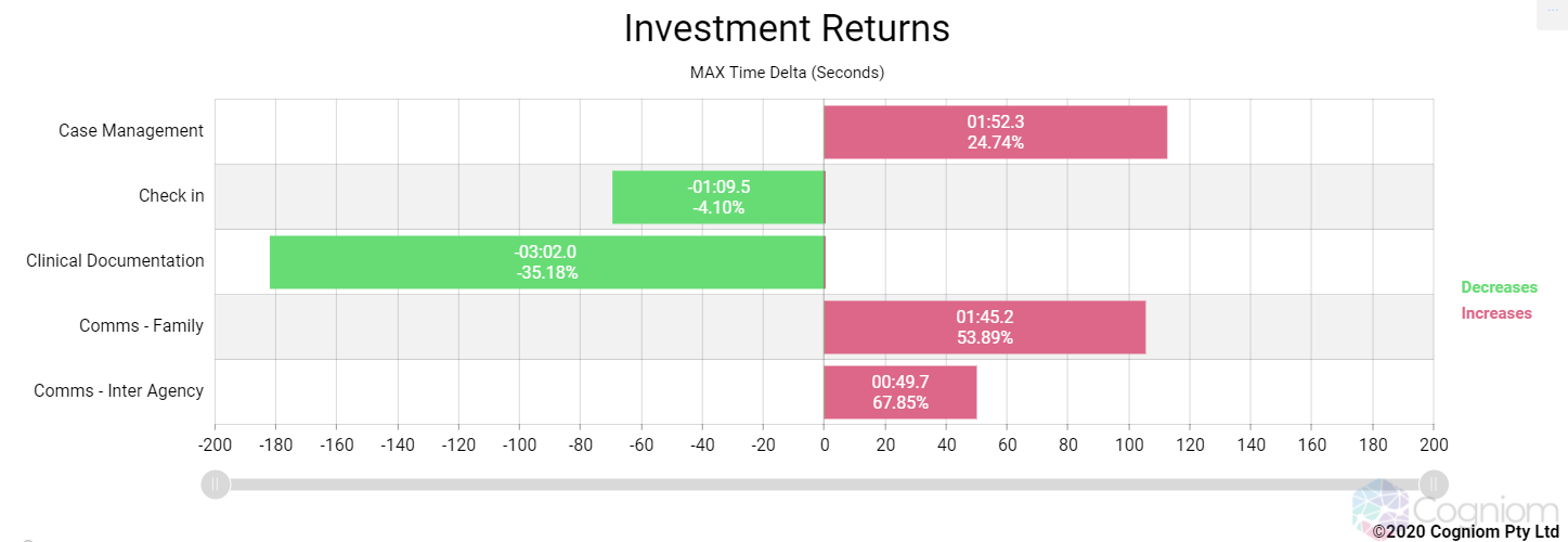
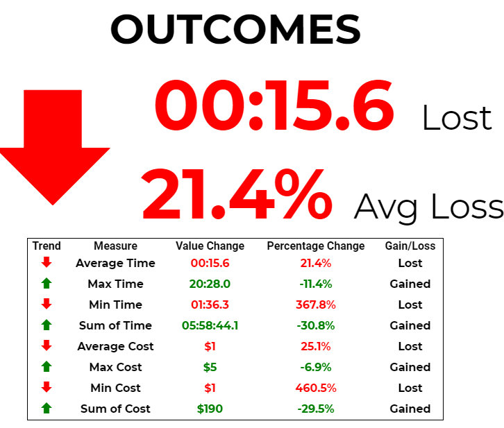
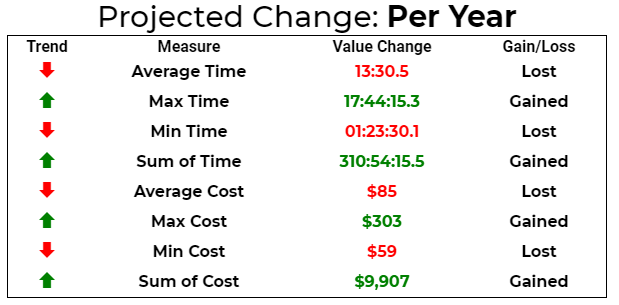
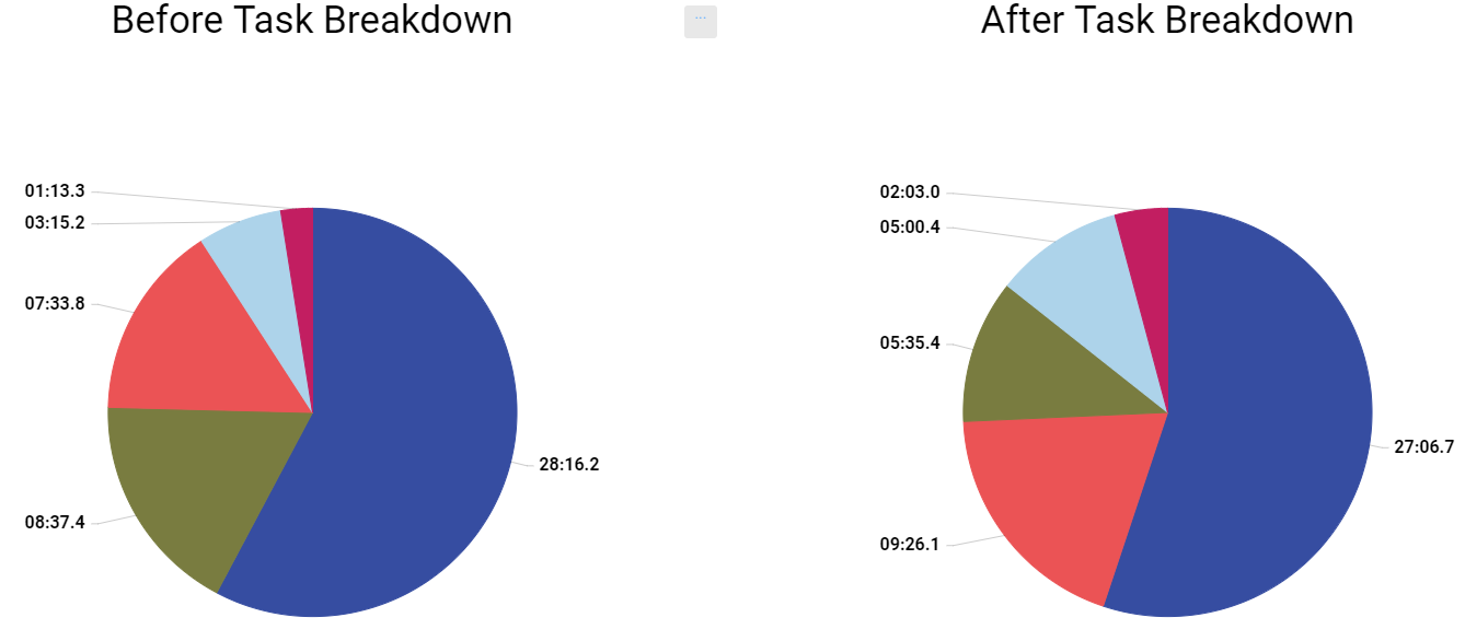
Introducing the ROI graph. This graph offers a ‘before and after’ snapshot and is designed for when you’re implementing something new. This answers questions like “Is this actually saving me money?” “Does is improve time spent for a particular process?”
ROI lets you define what the important tasks/metrics are, what’s your “Before” data, what’s “After”, and then details everything else in between! Take a look:
First, the flexibility and control afforded to let you choose what measures success in your eyes:


