There are a number of different types of Graphs available for you to utilise while bringing your data to life!
If there is a Graph type you’d like to use but can’t see in the current library, reach out to the team for a chat!
See Create a Graph in the section below for more.

BAR
Bar graphs presents categorical data with rectangular bars with heights or lengths proportional to the values that they represent. They are commonly used to compare things between different groups or to track changes over time
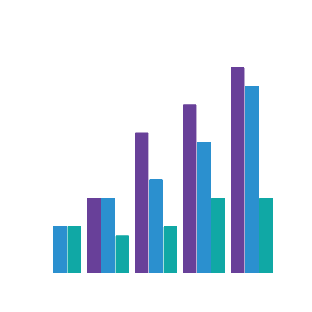
BAR – GROUPED
Grouped bar graphs extends the bar chart, plotting numeric values for levels of two categorical variables instead of one. It is used when you want to look at how the second category variable changes within each level of the first, or when you want to look at how the first category variable changes across levels of the second.

BAR – HORIZONTAL
The same as a bar graph, however displaying horizontally as opposed to vertically
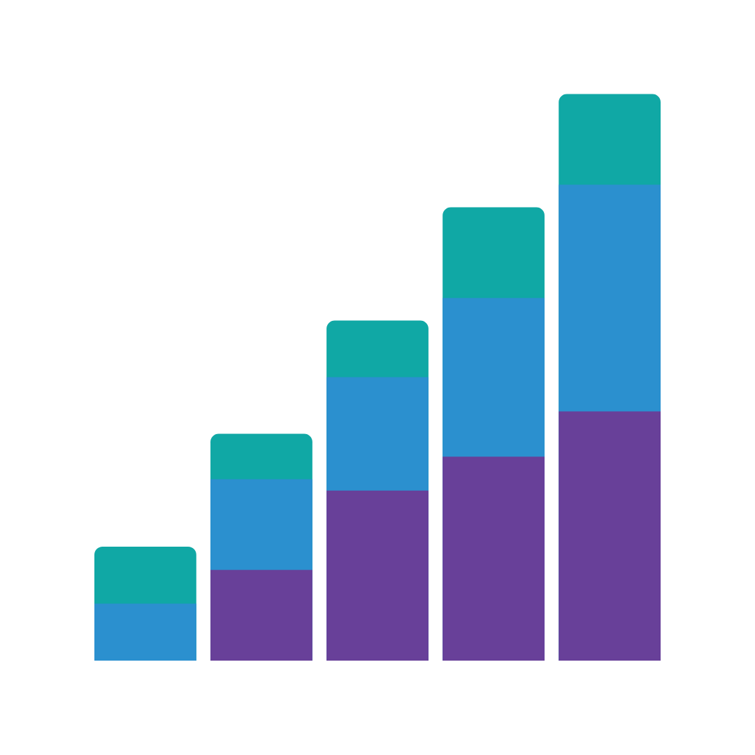
BAR – STACKED
In a stacked bar chart, parts of the data are stacked atop of each other in columns with each bar displaying a total amount, broken down into sub-amounts. Stacked bar graphs are great to show the parts of multiple totals.

BAR – STACKED 100
A stacked-100 bar graph is designed to show the relative percentage of multiple data series in stacked bars, where the total (cumulative) of each stacked bar always equals 100%.
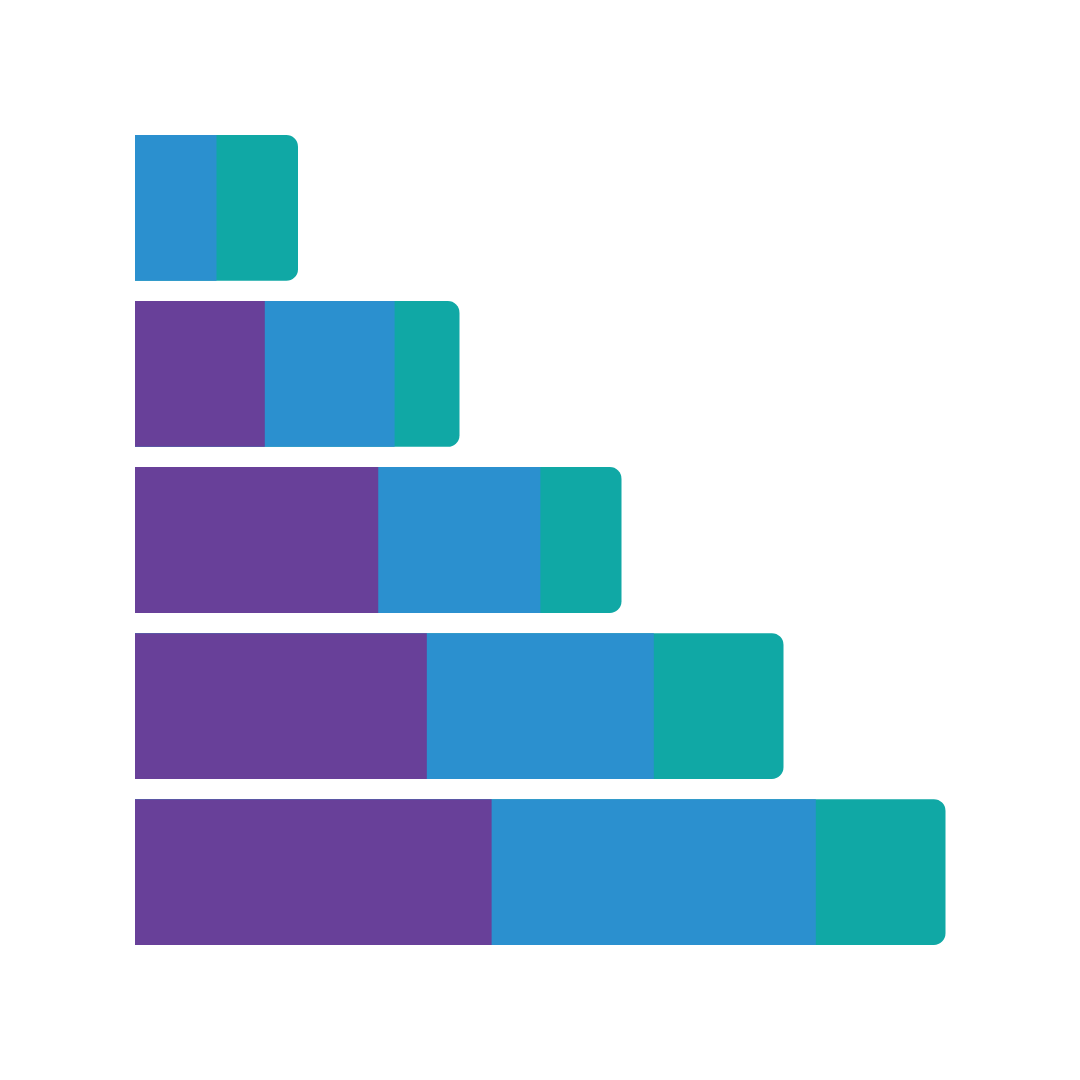
BAR – STACKED HORIZONTAL
The same as a stacked bar graph, however displaying horizontally as opposed to vertically
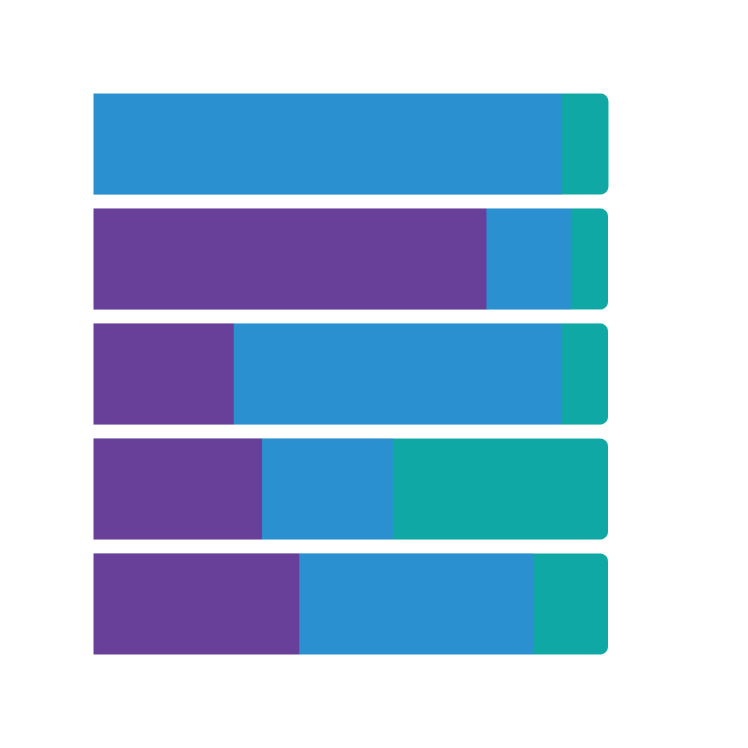
BAR – STACKED HORIZONTAL 100
The same as a stacked 100 bar graph, however displaying horizontally as opposed to vertically
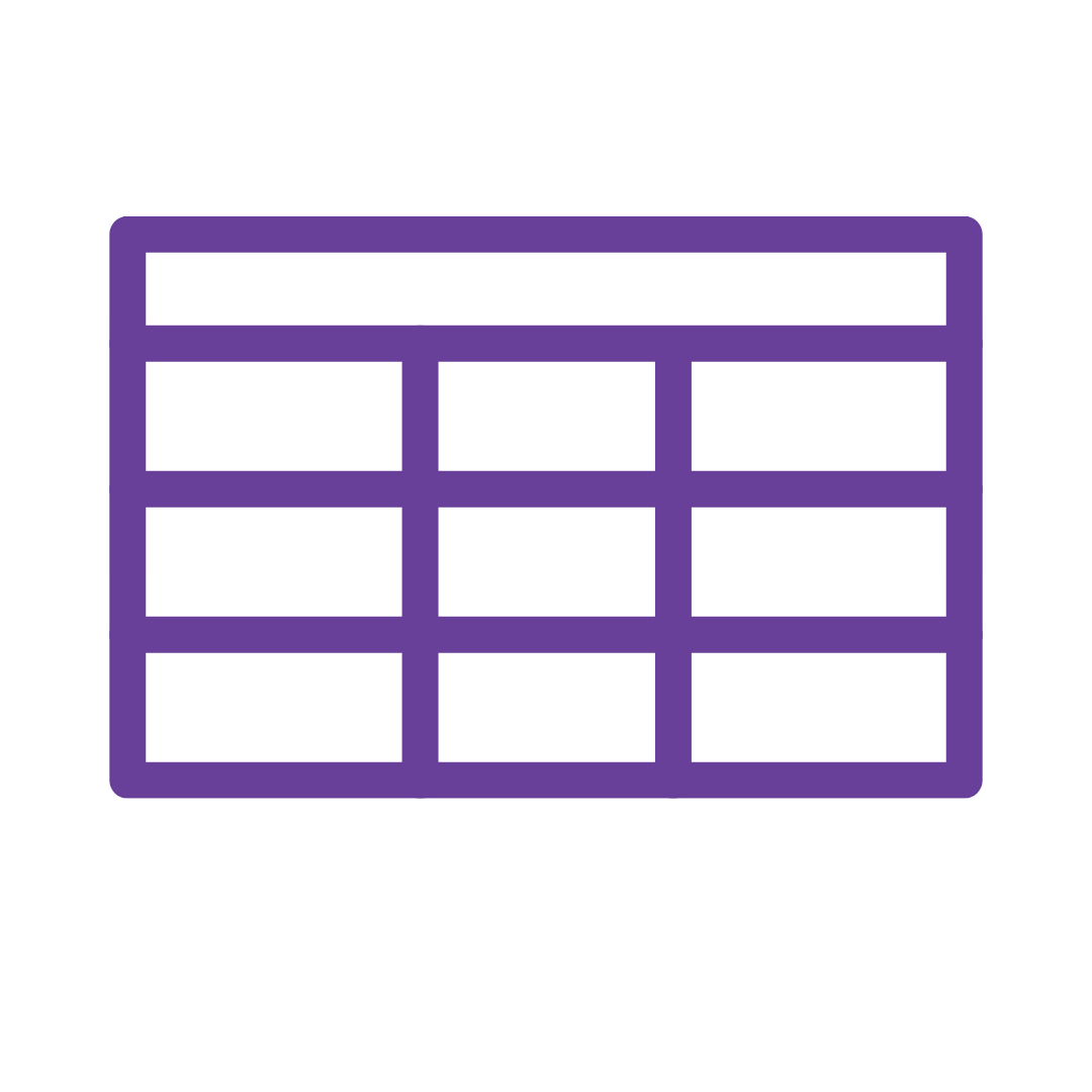
DATA TABLE
Sometimes you just don’t need a graph. Data tables is an easy way to display data with colouring and filtering rules applicable.
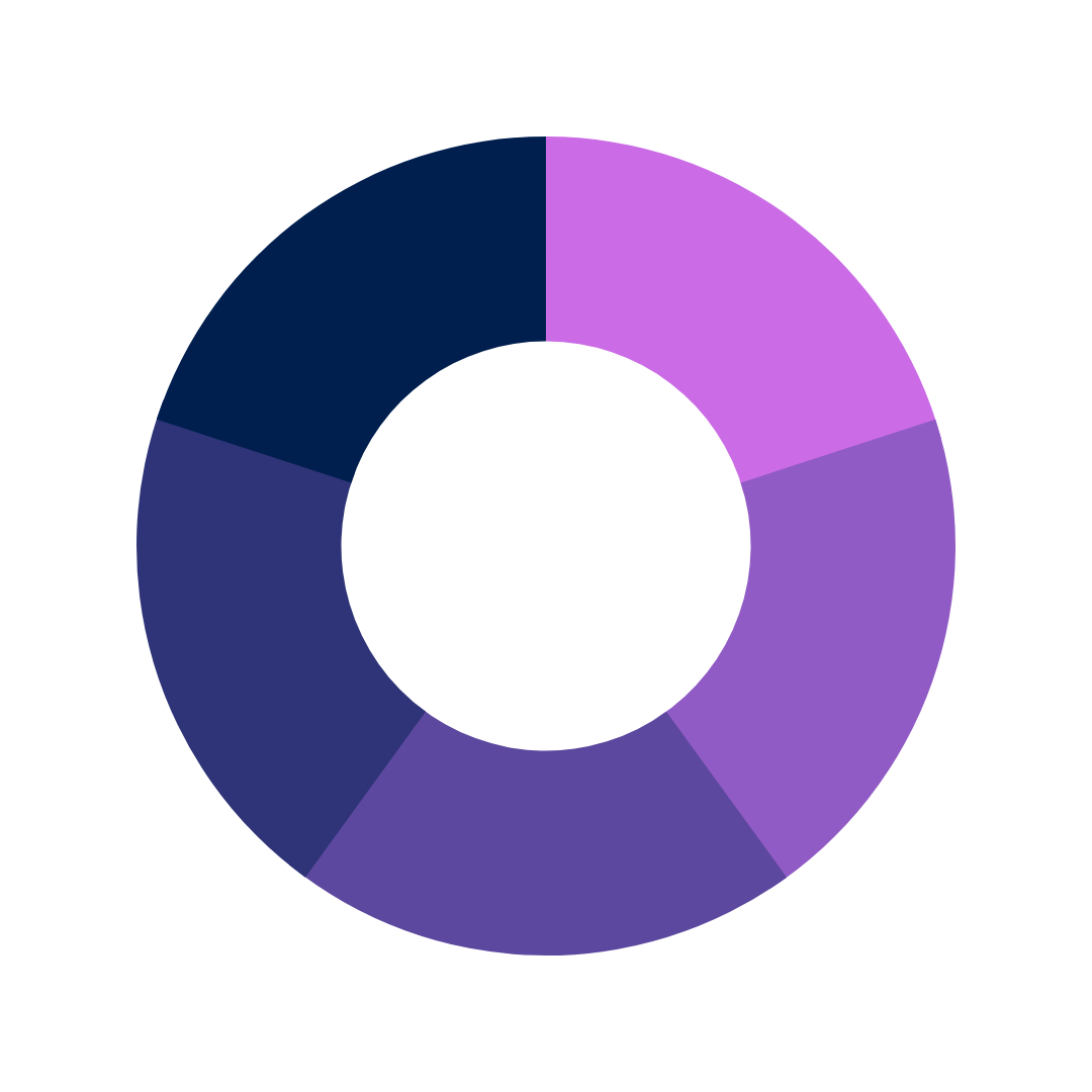
DONUT
The donut chart is a variant of the pie chart, with a hole in its center. It displays categories as arcs rather than slices. While it makes ‘part-to-whole’ relationships easy to grasp at a glance, it can’t show changes over time.

GANTT
A Gantt chart is a type of bar chart that illustrates a project schedule and helps to show the dependency relationships between activities and the current schedule status. They are great to see how a person’s day is paced out across all tasks they perform throughout a set period of time.
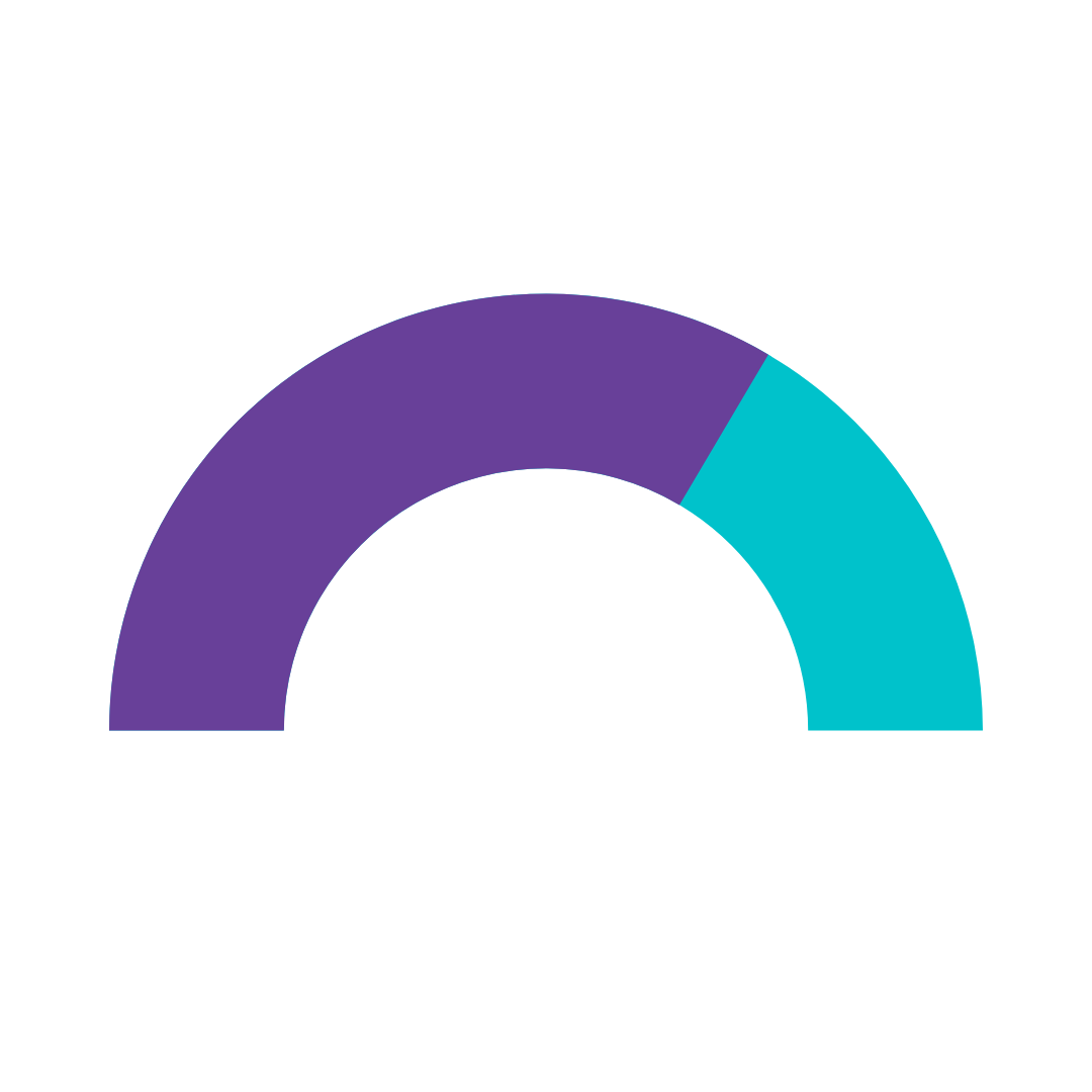
GAUGE (aka RADIAL)
A radial graph looks like a speedometer and is used to represent progressive values showing minimum and maximum values and a pointer to show information as a reading.
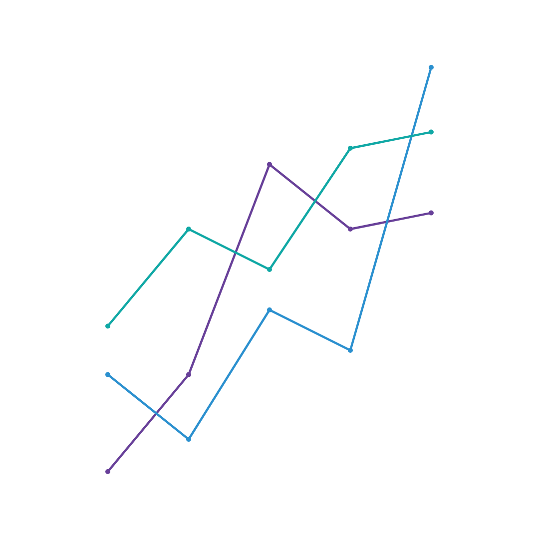
LINE
A line graph displays information as a series of data points connected by straight line segments. They are used to track changes over periods of time, and are optimal to highlight small changes (as opposed to a bar graph). Line graphs can also show comparisons of change over the same period.
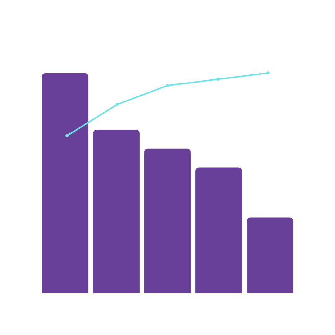
PARETTO
Containing a both bars and lines, a paretto graph showing frequency or cost and where the most frequent defects, complaints or inefficiencies. The lengths of the bar are always in tallest to shortest order to display the most significant area first.
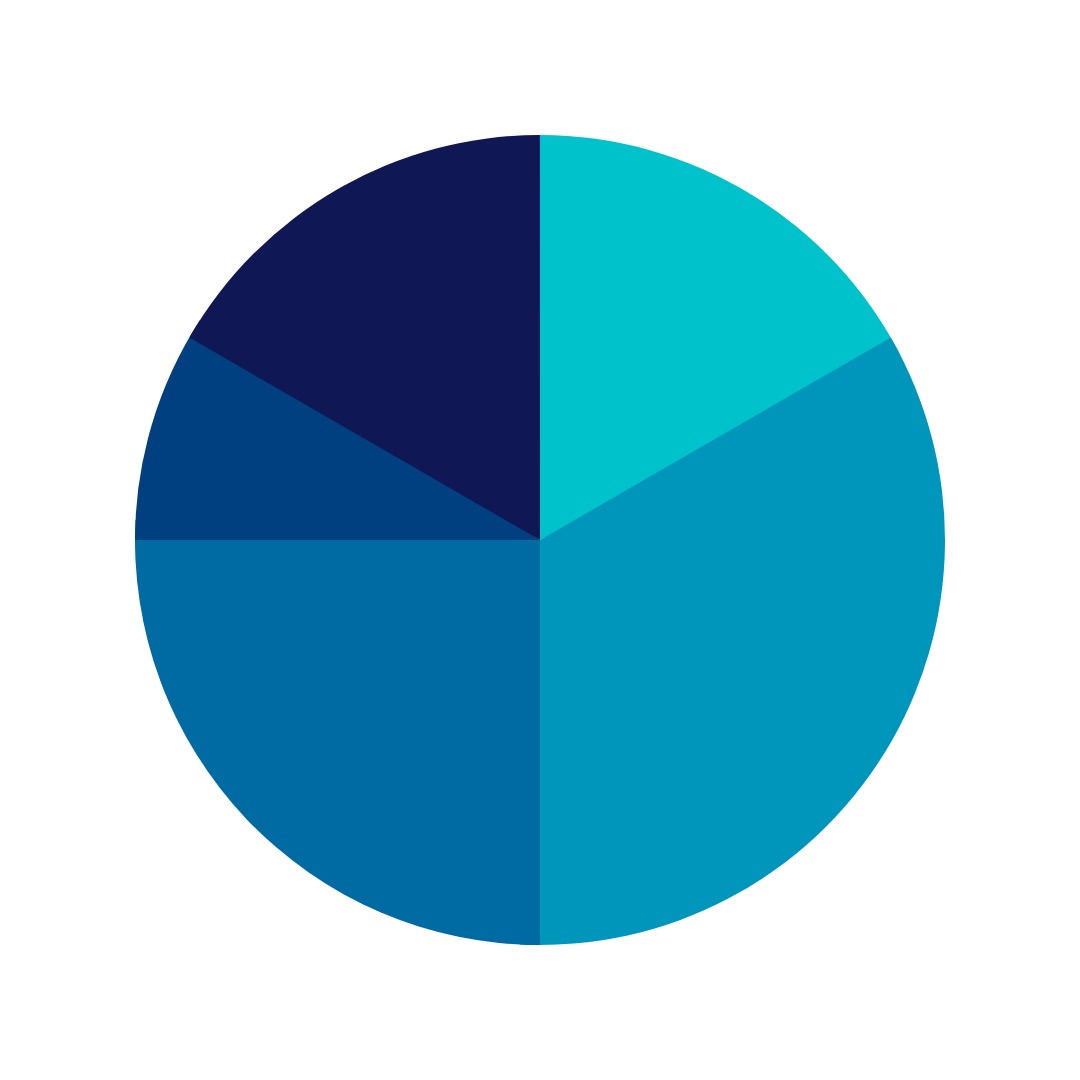
PIE
A pie graph is a circular statistical graphic, which is divided into slices to illustrate numerical proportion. In a pie chart, the arc length of each slice (and consequently its central angle and area), is proportional to the quantity it represents.

RADAR
A radar chart is a graphical method of displaying multivariate data in the form of a two-dimensional chart of three or more quantitative variables represented on axes starting from the same point.

RADAR STACKED
A stacked area chart is the extension of a basic area chart. It displays the evolution of the value of several groups on the same graphic.

RETURN ON INVESTMENT
A return on investment chart displays the before and after of a change or new implementation, outlining the comparison measurements in both time and cost.
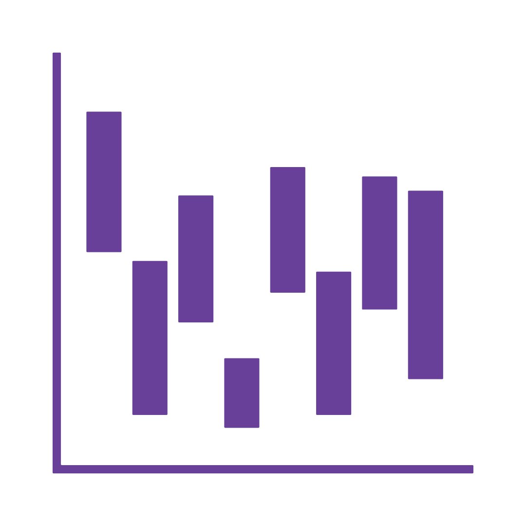
WATERFALL
A waterfall chart is a form of data visualisation that helps in understanding the cumulative effect of sequentially introduced positive or negative values. These intermediate values can either be time based or category based.
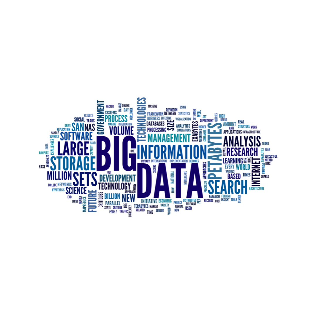
WORD CLOUD
Best used for displaying the results of a free text survey answer, a word cloud helps to visualise the most popular words collected by enlarging their size.
