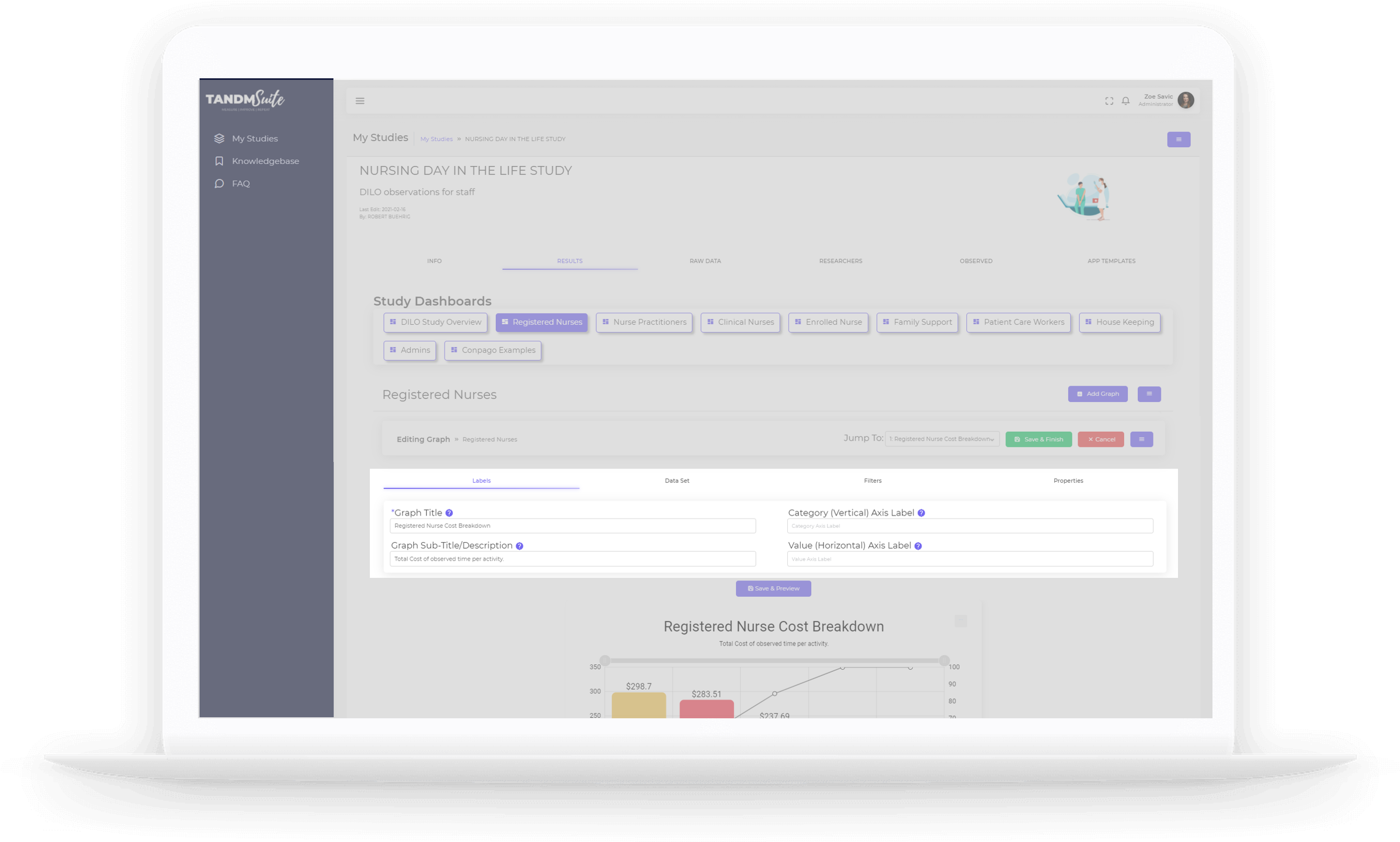
Editing graphs allows you to change and update the various filters on offer, especially as actual data is being collected.
To make changes to your App Template,
1. Click on the desired Study Tile from your ‘My Studies’ page. This will bring you to the Info Page:
2. Navigate to the “Results” tab
3. Click on the Dashboard that the graph you wish to edit is hosted on.
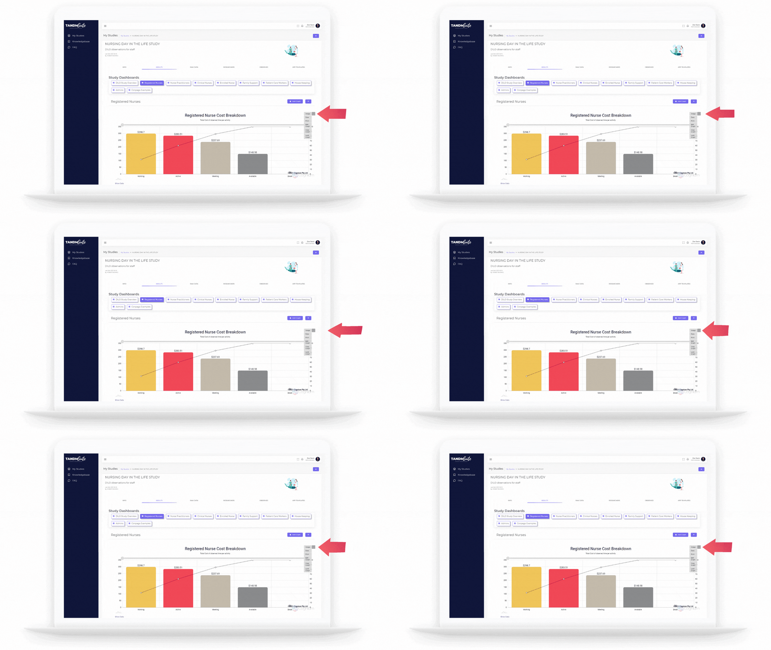
4. On the Graph you wish to edit, click on the ellipsis menu (three dots) and click on “Edit Graph”
This will open the Editing options with four new tabs:
– Labels, Data Set, Filters and Properties.
Labels
Labels will allow you to name your comonents in a manner that suits you.
– Graph Title
This is an instant identifier of what your Graph is representing.
– Graph Sub Title / Description
Use this field to give a little more context to what the Graph Represents
– Axis Labels
Depending on what the Graph type is will influence what is visable here. If applicable, you can add a name for the data components.
Once you’ve finished making your changes, you can click on the purple “Save & Preview” your changes.
To finalise, click on the green “Save & Finish button. Click Cancel if you do not wish to save changes.

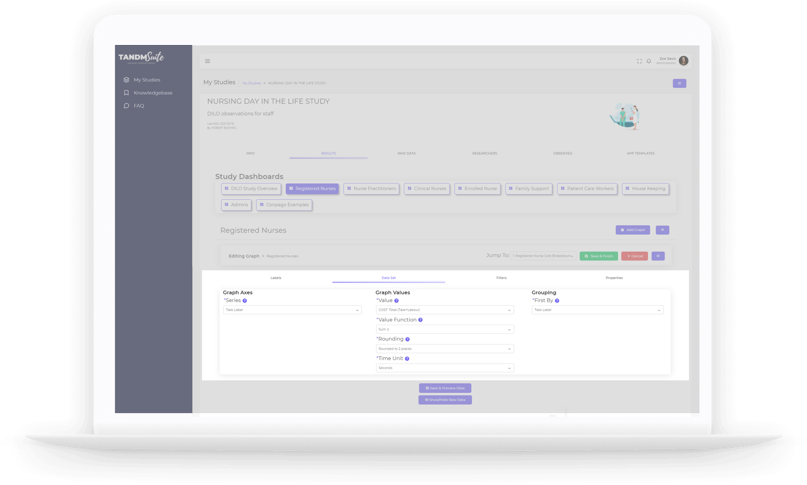
Data Set
This is where you bring data into your graph. The type of Graph will determin what you’ll see here but overall, this will be broken down into three main categories.
– Graph Axis/Axes
This will determine what data fields you are pulling into the Graph.
– Graph Values
This will determine what you are looking for within those data fields, how to calculate it and measurement units (if applicable)
– Grouping
This will determine how to present your data, the focus of the story this particular graph is telling.
Once you’ve finished making your changes, you can click on the purple “Save & Preview” your changes.
To finalise, click on the green “Save & Finish button. Click Cancel if you do not wish to save changes.
Filters
This is where you get to really drill down into your data. Using filters you can begin to pinpoint on certain topics but remember the more you filter the less data there is available to the Graph and may cause it to error.
To use the filter options, simply click on the check box associated (it will indicate if there is no data available for a particular option).
Once clicked the options you can select to filter by will appear based on the data you have collected.
Most options are straight forward given their titles, however check out some more intformation on the lesser known options below.
Once you’ve finished making your changes, you can click on the purple “Save & Preview” your changes.
To finalise, click on the green “Save & Finish button. Click Cancel if you do not wish to save changes.

– Location
Usually determined via a survey question in your app Template. Can be used to determine physical location or department
– Observed Name
The name given to the person/item/process being observed.
– Observed Detail
These options are drawn from survey questions within your template/s and are often used to capture demographic data.
– Researcher Name
The name of the person collecting the data. Usually only available with ‘Pro’ templates.
– Tasks
These are the ‘buttons’ on your App. Tasks from all App Templates will appear here
– Task Labels
These labels are usually applied via the App when collecting data. This allows a researcher to label different tasks, forming a collective or overal groups to filter by.
– Task Types
This is pulled from your App Templates based on the types of timers, counts or survey questions that have been used.
– Survey Answers & Tags
Just like the Tasks is a collection of all the ‘buttons’, this is a collection of all the Survey answers in your App Templates. IF you use a RetroTag timer, the ‘tag’ option will also display here.
– Template
If you have more than one App Template contributing data for your Study, this will filter data by template.
– Time
Narrow down to see data collected on particular day or timeframe.
Properties
Here you can put the final touches on your graph.
– Height and Width
Adjust the height and width of the graph to make them appear half, a third or a quarter of the page width. Applying this to other graphs to make them appear on the same row.
– Data Table
Sometimes you’ll see at the bottom of a Graph a link called “Show Data” when you click on this link it will reveal the raw data associated with building the Graph. In order to have this link available, make sure this checkbox is ticked.
– Lock Graph
Tick this box to prevent any Dashboard filters affecting the Graph
– Zero Fill Survey Answers
Have survey answer options that received no response appear on the Graph.
