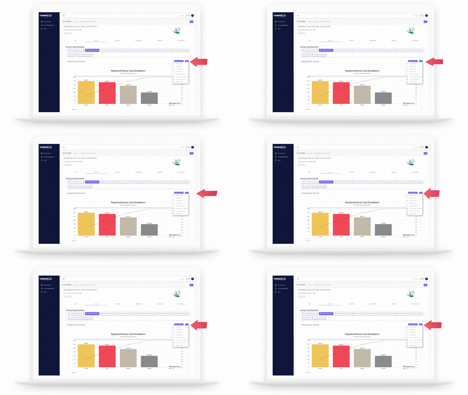
To edit Dashboard properties, click on the desired Study Tile from your ‘My Studies’ page. This will bring you to the Info Page:
1. Click on the Results tab.
2. From the list of Dashboard tiles, click on the Dashboard name you wish to edit
3. Once selected, click on the purple hamburger meny (three lines) and select “Edit Dashboard”.

Properties
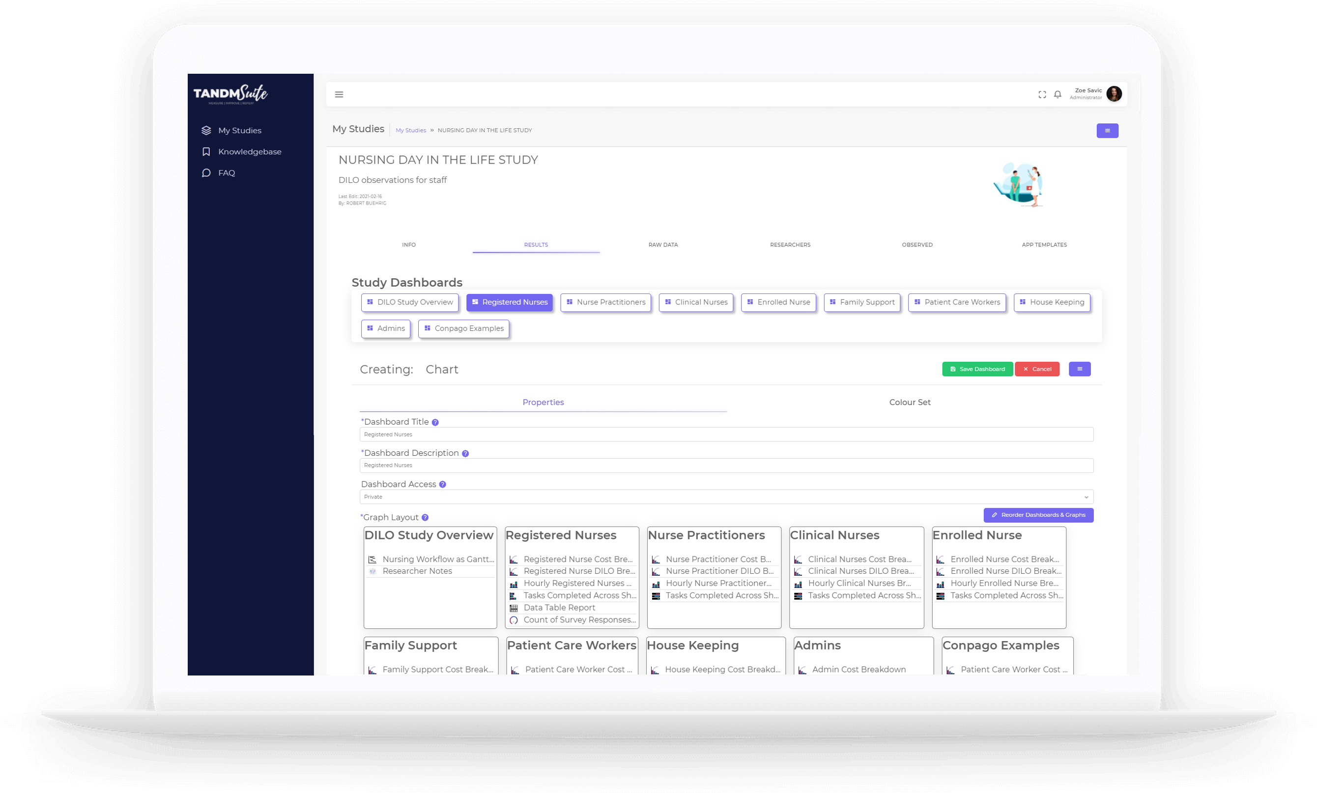
In Properties you can make changes to
– Dashboard Title:
This will appear in the Dashboard tiles so make sure it is easily identifiable
– Dashboard Description:
This will add more context to the contents of your Dashboard and will appear when a Dashboard is opened in an “External Tab”
– Dashboard Access:
Use the dropdown to adjust. A Private setting will mean people will require login details to access. a Public setting will allow anyone with the link to view the dashboard.
– Graph Layout
Click on the purple “Reorder Dashboards & Graphs button to trigger this feature.

The layout displays each Dashboard as a main tile and each Graph as a smaller inside of them. Simply click and hold the item you wish to move and drag it to your desired location. You can change:
– The order of Dashboards,
– The order of Graphs inside each Dashboard, and
– Move a Graph from one Dashboard to another
If you wish to delete a Graph or Dashboard simply drag and drop it into the red “Delete” area.
Click the green “Finished” button to complete.
Colour Set
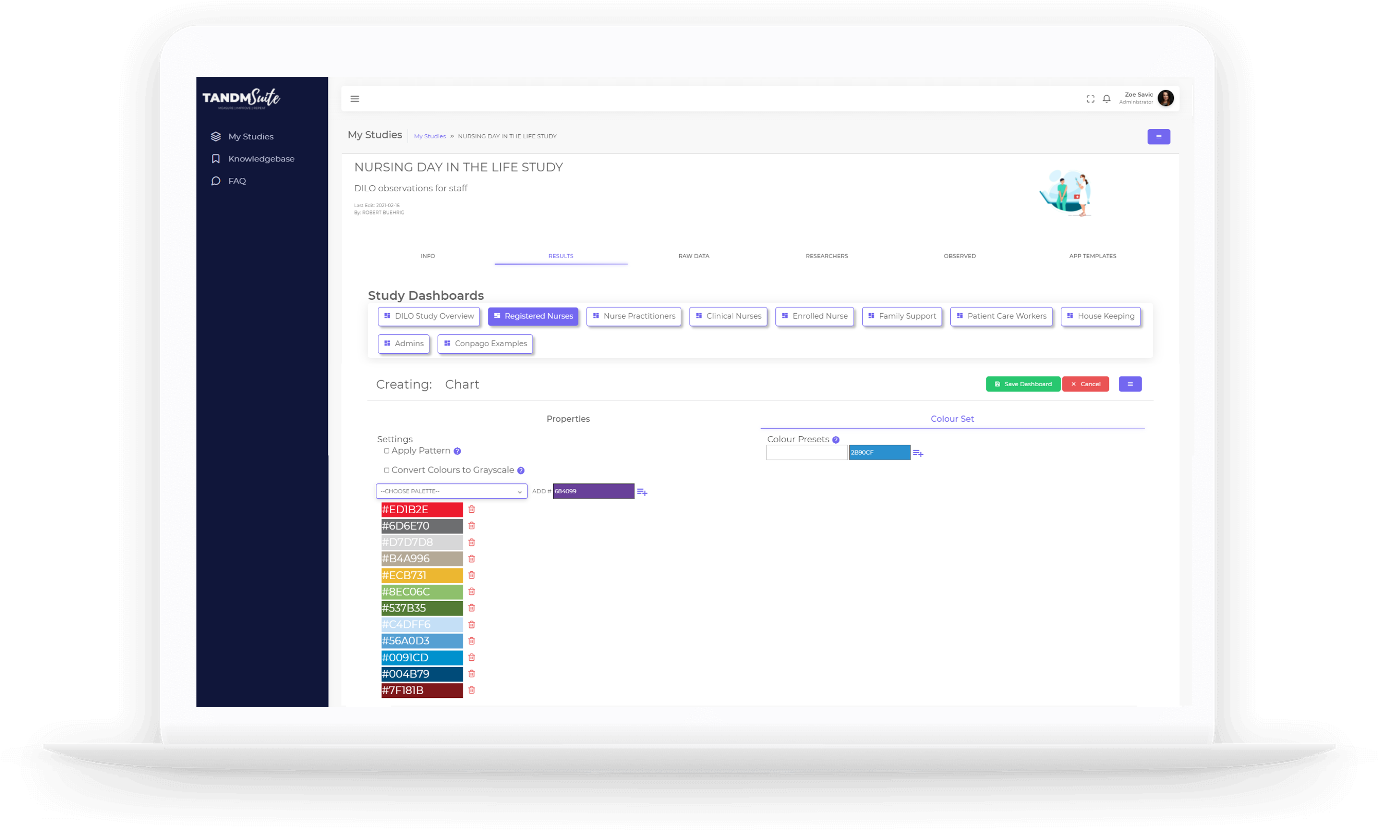
Here, you can personalise your Dashboards to suit your reporting requirements and branding needs.
Note: if you have locked any of your graphs, changes made here will not take effect.
– Settings:
Some reporting requirements are strict with how Graphs can be presented. Using the tick boxes you can elect to incorporate patterns and/or greyscale customisations.
For colouring options, you can use some of the predetermined colour palettes by using the dropdown menu or manually add your colour preferences.
Simply type the colour code in the field and click the add icon to include it in the list.
To change the order of the colours simply drag and drop the items into your preferred order.

– Colour Set:
This feature helps with continuity. If you have data items that repeat through multiple Graphs, the colour presets will ensure the same colour is always used for particular items.
Simply,
– Type what the data item is in the text field
– Select the colour you wish to allocate against the data item
– Click the add symbol to complete
When you’re finished making your changes, simply click the green “Save Dashboard” button. Click cancel to exit without saving.
