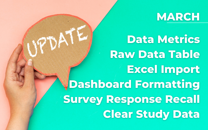
See whats new inside the TANDM Suite with this month’s software updates.
TYPE: New
WHERE IS IT: TANDM Suite Admin – upon request
FEATURE: Metrics
SUMMARY: We now offer Calculated, Point 2 Point, and Until Metrics to augment your current Observations and apply any logic required to your data set.
Perfect for population and demographic type of studies like Net Promotor Scores, DAS21 and K10

WHY IT MATTERS: Calculated Metrics – Often raw results must be post-processed to take on meaning. NPS Scores, DASS, these are quick and easy surveys, but there’s a dash of maths to make them magic. We can now do that magic in real time for any Study and any Formula. Point 2 Point Metrics – Some things happen with multiple steps, but you want to know overall time. Like a patient visit might start with process A, but end with process ZZ, so Patient Vist is Start of (A) to End of (ZZ). Until Metrics – Sometimes dead time is the problem. Until Metrics allow you “wait” for something to happen, and measures the time in between activities. Like that important agenda topic that you asked Team B to take care of, you asked last week, but you want to measure the time Until you get a response. Internally we call Until Metrics “Ball in Court” measurements.
*PRO Tip: If you think Metrics is something you want to know more about, reach out to the Cogniom Team for more information! They will be pre-made in a Bundle coming soon!
WHERE IS IT: ALL Bar Graphs
FEATURE: Dynamic Label Rotations
SUMMARY: Labels are rotated to 45 and sometimes truncated (shortened with an ellipse) but have tooltips to show the full text.

*PRO Tip: Remember you can change the Height/Width of your Graph on the Dashboard which will change how Labels are handled!
WHERE IS IT: Results Tab
FEATURE: Dashboard Picking
SUMMARY: Choosing the Dashboard to display is now done with tiles instead of text links

WHERE IS IT: Raw Data Tab
FEATURE: Raw Data Table always shows latest Observations
SUMMARY: Previously this table was Observations present when you first loaded TANDM, but now each time you go to that tab, the latest Observations are updated.

WHERE IS IT: Raw Data Tab -> Menu -> Import Data
FEATURE: Import Data into TANDM Suite
SUMMARY: The interface will parse out your excel sheet to find the column headers and then allow you to Drag & Drop the fields to create a mapping to TANDM Suite data and import as you see fit.

*PRO Tip: If you want to change the mapping, re-upload the spreadsheet, and then click “Go Back” to get to Step 2, then you can re-do the mapping. Also, we check for any duplicate data, so when in doubt, just upload the sheet, we’ll ignore anything we’ve already imported.
WHERE IS IT: Results Tab > Edit Graph > Properties Tab
FEATURE: Graph Height and Width properties
SUMMARY: You can change the Height of the Graph to be any number of pixels you choose, and you can choose from 100%, 50%, 33%, and 25% for Graph widths.


TYPE: New
WHERE IS IT: TANDM App > Pro & Lite!
FEATURE: Survey Response Recall
SUMMARY: Make any Survey answer “remember” what the response was last time for this Observed.

WHY IT MATTERS: No one likes repetitive answers, but sometimes you need to re-visit the same Observed with new activities. This new feature enables Survey responses to be “remembered”, so that you don’t have to fill in the same answers as often.
TYPE: New
WHERE IS IT: Study Menu > Clear Study Data
FEATURE: Clear Study Data
SUMMARY: This will remove everything except the configurations from your Study. Observed, Notes, Insights, Tags, will all be erased.

WHY IT MATTERS: It’s the “reset” button when you’ve been playing with some sample data and are ready to discard that and get started on real data collection.
TYPE: New
WHERE IS IT: My Studies Page
FEATURE: Show Archived Studies
SUMMARY: You can now very easily find Archived Studies.
WHY IT MATTERS: Studies are automatically archived a month after their End Date, so they won’t appear in your Study List anymore. Now though, if you need to go back and review anything you can just hit this button and ALL Studies you have access to will list.
TYPE: New
WHERE IS IT: Graphs > Gauge Graphs
FEATURE: Gauge (Formerly Radial) Graph Enhancements
SUMMARY: Gauges have a handful of new and useful functions to make them more versatile.

WHY IT MATTERS: Now you can: Rotate, Change Arc Angle, Use Banded Colours or Gradient Colours, Label, and change Direction of the Gauge. This gives a LOT of options to leveraging these for numeric summaries in your Dashboards